
In an earlier post I took a swipe at the likes of NAB, the RBA, Bernard Salt at KPMG, the ABS themselves, Business Insider, and Macrobusiness for their persistent failure to mark a sweeping definition-change that completely broke the continuity of the migration data they were reporting. I should write to them all and apologise for the fuss, because their indiscretion has been completely overshadowed by the perhaps the most ghastly abuse of data I’ve ever seen.
If ever there was a case of truly atrocious, and utterly deceptive use of data being deliberately used to draw exactly the wrong conclusion, the gong definitely has to go to UBS investment bank, and a couple of Fairfax journalists who have swallowed their grabage whole. If first noticed this graph, which I noticed in the AFR a couple of weeks ago published by Jacob Greber:
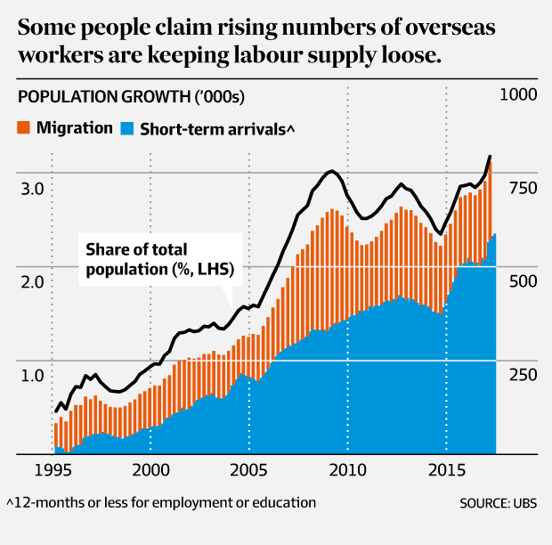
Figure 1: The Australian Financial Review plumbs new depths in quality of data presentation
The litany of data-sins committed in this graph is so galling that I barely know where to start. Let’s start where I started with everyone else: a failure to point out the definition change in Net Overseas Migration in 2006. But there’s so much more. The columns here are at quarterly frequency, but the rate implied is actual annual, so we can’t really gauge the order of magnitude. ‘Migration’ isn’t defined, though I can see they mean the official Net Overseas Migration statistic. Read literally, the label ‘Short-term arrivals’ suggests one-way movement, though one suspects (or hopes) they mean net arrivals. The only clear lablel is “POPULATION GROWTH”, which is the only one which is absolutely uncontravertabely incorrect, since there’s no inclusion of births and deaths, let alone any justification for stacking up the official Net Overseas Migration with a selective, small sub-set of short-term movements.
A couple of days ago another Fairfax journalist, Chis Kohler from Domain, dashed to defend the indefensible, and attempted to explain what was going on here. He produced this article and video-blog about the how the UBS’s ‘People Growth’ measure is actually running at 3.5%, since Net Overseas Migration only catpures “half the story”. It would actually be an impressive 90 seconds of video-journalism if the facts it relied upon were not so completely rotten to the core. And happily Chris uses a graph that’s actually properly labelled:
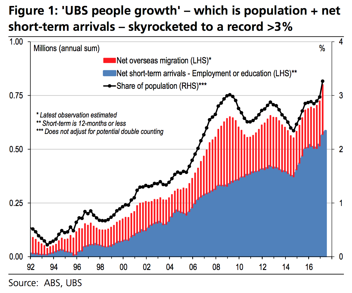
Figure 2: The Australian Financial Review plumbs new depths in quality of data presentation
Unfortunately Chris missed the triple-asterisk, pointing out the epic flaw in heart of this graph which makes it so utterly erroneous, misleading, and altogether an absolute abomination on the analytic and data-serious community that I once thought UBS might belong to. So sadly the essential point of his video and article is a 100% true-blue, genuine, balls-to-the-wall, factual blunder.
***Does not adjust for potential double counting
GULP. Contrary to Chris’s assertion in his article, Net Overseas Migration does not just include permanent residents. Infact, it has absolutely nothing to do with someone’s visa status at all. As I’ve laboured before, it’s an arbitrary definition that counts someone as ‘resident’ if they are here for 12 out of 16 months cumulatively, and non-resident if they are overseas for the same cumulative part of any 16 months. Three quarters is the rule that determines if you’re resident or not. It’s a rule designed specifically to capture the ‘expats’ that Chris dwell so heavily on as if they’re the missing piece.
Furthermore, as I’ve also pointed out before, a large number of the person-years present (akin to what UBS calls ‘people’) caused by Short-Term Arrivals are actually contributed by relatively long Short-Term Arrivals, of 6-12 months:
Figure 3: Longish Short-Term Arrivals than one month have the largest contribution to persons absent
If these arrivals are students who are here for a course/visa that lasts a couple of years, but take a sizeable ‘holiday’ back home or elsewhere overseas during their course, it’s almost certain that they’ll become ‘resident’ under the 12/16 rule of Net Overseas Migration, as well as arriving at least twice, “Short Term” for Education in Australia. So UBS’s graph will actually triple-count those people, or worse, if they take another trip home.
Why would UBS ever present such data in the first place, if they know it’s likely to present such completely misleading false conclusions? The mind boggles. Perhaps they don’t even realise. It’s the pinnacle of embarrassment for an investment bank. If I were wealthy I’d make sure that my money never went near the hands of people doing analysis like this.
A recipe for data-deception
To see the full glory of the strange contortions that are required to build a graph like this, let’s go through the raw data step by step. First let’s take the raw monthly data on short-term arrivals:
Figure 4: Monthly Short Term Arrivals by Purpose shows strong seasonality
That’s right, peer down the bottom there, you can just make out the education, but barely the employment lines. Double-click on those items in the legend if you want to actually see what’s going on. It also helps a little bit to smooth out the data by looking at totals as per the previous 12 months:
Figure 5: Monthly Short Term Arrivals by Purpose over previous 12 months show trends, and magnitudes
What’s strange about this data, other than the trivially small level of the Education and Employment lines? Short-Term arrivals have been surprisingly flat for much of the 2000s, particularly for Holidays, which is worrying for tourism. It certainly contrasts to the Departures:
Figure 6: Monthly Short Term Departures by Purpose
Here we can see that there’s been explosive growth in outbound holidays from Australia.
Figure 7: Monthly Short Term Departures by Purpose over previous 12 months show trends, and magnitudes
Education and Employment are also tiny compared to every other kind of Short-Term Departure. But most importantly, you can see that the magnitude of holiday departures is far larger than the arrivals. Netting that out, we can see the net short term-movements by purpose:
Figure 8: Net Movements by Category
Now we can really see the deceptiveness of UBS’s selection. Not only are Employment and Education relatively tiny in the overall scheme of Short-Term Movements, they’re essentially the only two that net out to a positive result. This is even clearer in the previous 12-months trend:
Figure 9: Net Short-Term Movements Previous 12 months by Category
I wasn’t kidding about the students taking holidays back home. Here it is in the statistics. As I’ve previously argued, Australia is a great place to arrive long-term (like to study) and take frequent trips away from, whilst arriving back each time for some longer-term (but quite possibly still temporary) purpose. That’s what explains the seemingly impossible phenomenon of Australia losing a couple of million people annually, for a decade, on holidays. Our increasingly part-time population makes official ‘resident’ population estimates decidedly frothy when compared to the actual number of people physically here.
Or, you could ignore the greater context that is orders of magitude larger, and select the two largest positively netting lines, and add them up, to get UBS’s concocted addition to migration for ‘people-growth’:
Figure 10: Re-Creating People
And if we pile on top of that the Net Overseas Migration figure, and ignore the definition change in 2006 which makes the data incomparable, you can finally see where UBS got their data:
Figure 11: Re-Creating People
How do we improve on this? Think clearly and carefully about which numbers do and don’t add up or overlap, and find the ones which actually reflect real changes in Physically Present Population due to people coming and going overseas. Which two numbers are those? Drumroll please. Total Arrivals less Total Departures. That cuts out all the arbitrary, overlapping, unclear definitions regarding visa types, categories, and stated intentions of purpose and length of stay on departures cards. Despite the ABS’s best efforts at burying clear, clean, and raw data, it’s hardly rocket-science.
And this analysis tells us the opposite of what UBS is trying to tell us. For the last decade or so, people growth has actually been much smaller than official Net Overseas Migration. The cumulative effects of all movements in and out of the country have added on average just over 100,000 people per year, nothing like the ridiculous 600,000+ figure implied by the UBS graph:
Figure 12: Long-Term Cumulative Net Movements shows steady linear growth
Net Overseas Migration, on its own, has substantially over-stated the actual growth in the Physically Present Population (which we might call ‘people’, to adopt the lingo), which is now a million people less than the arbitrarily defined ‘Estimated Resident Population’:
Figure 13: The cumulative discrepancy between official NOM and the population actually in Australia has exploded
So when Chris Kohler says that population growth based on Net Overseas Migration (NOM) is only half the story, he’s kinda right, but in all the wrong ways. Actually NOM is almost double the story, if he’s talking about the actual number of people physically here due to overseas movements.
Australian cities might be feeling busier and more crowded for a range of reasons. Low unemployment, more part-time jobs, increasingly city-centric job growth, higher labour mobility, more holidays away, longer commutes, urban development along concentrated growth corridors, poor infrastructure, a decline in working from home, more female in workforce participation, the list goes on. Unmeasured population growth, or ‘people growth’ is not one of them.