
It’s time that someone took a proper tilt at Australia’s high migration rate. No, I don’t mean like Dick Smith, splashing millions on an advertising campaign arguing that such a high rate is unsustainable and that we should return down to previous levels. I mean taking a few hours with the data source to figure out whether Australia’s migration rate actually is any higher than it was at previous levels.
The Population Ponzi story tells us that sometime in the mid-2000s the Howard government kicked the gate-open to mass migration to feed the mining boom, then an un-holy alliance between big retailers, property developers, and budget-stressed politicians allowed the gate to stay open ever-after. The sustained influx of immigrants post-boom can then explain most things weird and worrying about our economy, including per-capita real income falling, low wage growth, and high house prices.
The alternative story is that sometime in the mid-2000s the Australian Bureau of Statistics changed the definition of an official statistic called “Net Overseas Migration”. The arbitrary definition they had at the time was malfunctioning, and the next arbitrary one they changed to has been malfunctioning even worse. A blithely ignorant press didn’t even notice the change, let alone query the disfunction that inspired it, so the entire country has been putting their faith soaring population figure that has the integrity of custard. The harder alternative figure shows that our migration rate is actually flat. The confusion probably explains even more weird things, like low nominal GDP growth, low tax revenues, not to mention wage growth and per-capita everything. House prices are worrying, but not weird. Something else simple explains them, but that’s a tilt for another day.
Read this post if you’re not sure which to believe.
Why the NOM graph matters more than most
As far as graphs go, Net Overseas Migration, (NOM) would have to be one of the rising-stars in Australian economic policy debates. The significance of NOM to housing (hence banking, hence sharemarket) is pretty obvious. It also makes a crucial contribution to ‘Estimated Resident Population’, perhaps one of the most important statistics that’s relied on for imputing, scaling and basing a host of other crucial statistics.
But this particular graph’s influence has also risen the tide of confusion swamping the world’s economists, who are floundering to explain the new low-inflation, low-growth new-normal paradigm that has beset the Western World. Everyone’s casting around for a theory. With a slightly selective date-range (say from around 1991 onwards), this graph gives some Australian pundits and commentators exactly what they want: some substantial level-shift that occurs somewhere around the GFC, and hasn’t returned to old normal levels. (Use the zoom/selector tool to cut out the pre-1991 part to soak in the less-than-full picture.)
Figure 1: The standard shape of the official ABS Net Overseas Migration Series
You can see why people are arguing that someone kicked the gate open. Apparently in the 2000s Australia suddenly started letting over 200,000 people in every year, when previously we took about half that amount.
Overseas there is plenty of credible economic commentary, particularly in the US and Europe arguing that more migration would be a very good thing for their economies. It’s fair to say that social issues dominate the case against migration, which would probably be economically beneficial if it was legitimised, and very much so if you could select well-educated foreigners who weren’t refugees. Land-borders make that a non-trivial issue in the US and Europe.
Two things set us apart. Sea-borders are one, which means we take control of migration for granted. You don’t have to sound bombastic by proposing to build a wall when you’ve already got a moat. The second is this graph, which appears to show a such a dramatic level shift to a higher level than most other Western Countries. The shift appears so clear that it has sparked something of a dalliance between some respectable economic thinkers, and the ‘Population Ponzi’ theory, which makes out that Australia’s rapid population growth could be masking, or worse even causing, some real economic problems.
The devil’s in the detail. Or maybe just the definition.
I mightn’t have ever noticed the definition shift if I hadn’t attempted to reproduce two columns in an ABS Demographics spreadsheet called ‘Arrivals’ and ‘Departures’ from numbers in two other spreadsheets called ‘Arrivals’ and ‘Departures’. That’s right, the ABS keeps these series in separate places, with different catalogue numbers (310101, 340101 & 340102), with different date ranges, and different frequencies of data entries. One would think they’re keen fend off amateur analysts attempting to check their numbers.
I couldn’t get any of the series to add up together, even after creating a little package of code in R to manage the necessary wrangling to compare the periods. I wanted to assume that some simple addition of the Permanent and Long Term Arrivals would produce the 3101 Arrivals, and same with Departures, and the net of those would produce (or at least closely follow) the hallowed NOM. Please enjoy chuckling at my naivety. In fact the net Permanent and Long Term movements give a trend that’s far higher than Net Overseas Migration. The Net Short Term movements, on the other hand, used to be trivial, but had in recent decades had become quite large and negative.
Figure 2: Net Movement figures don’t replicate Net Overseas Migration
This demanded the question: how did the ABS decide just how many of those net movements that were classified in one series as ‘short-term’ to blend in with the ‘long-term’ ones to conclude what constituted ‘migration’? I expected somewhere deep inside the explanatory notes that I’d find some arbitrary rule that had to be followed. The explanatory notes had two, with the switch between them occurring just before the ‘level shift’. Here are the direct quotes:
22 The ABS developed and introduced an improved method, called the ‘12/16 month rule’ methodology, for estimating NOM. It has been used in calculating Australia’s official ERP since September quarter 2006. The ‘12/16 month rule’ methodology is a result of reviewing the treatment of temporary migrants (both long-term and short-term) who are away from or resident in Australia for a period of 12 months or more.
23 Estimates of NOM based on the previous methods and those based on the ‘12/16 month rule’ methodology are not comparable. The key change is the introduction of the ‘12/16 month rule’ for measuring a person’s residency in Australia, replacing the previous ‘12/12 month rule’.
“Not comparable” is the correct (one would hope unavoidable) conclusion about such a substantial change in method. But overall I think my gratitude for the ABS spelling out the obvious is overwhelmed by my dismay at their burying this insight in paragraph 23 of the ‘Explanatory Notes’ tab, where only the most determined and tireless of data consumers are likely to encounter it.
Not the slightest mention, flag, warning, column change, name change, or label can be seen anywhere near the actual spreadsheets available for download. So with almost no exceptions users tend to string it together on one axis, in sequence, in one line, in one colour, blithely ignorant of the fact that they’re plotting two different bits of data which are “not comparable” according to the producer of the data.
It’s hard to overstate how bad that really is. It’s the kind of slop which hung-over first-year uni students cobble together on the bus on the way to a tutorial which requires attendance but doesn’t grade exercises. If they do it in assignments, they fail. Yet all of Australia’s leading economists are doing it relentlessly, if accidentally.
How one should, or should not present “not comparable” data
Let’s be geeky and consider how to properly present the data. (Feel free to borrow my code if you’ve been unwittingly guilty of the misdemeanor and would like to produce some better plots.)
Undoubtedly the best way is to just plot two different graphs, and lament the fact that the ABS hasn’t recorded something through the long sweep of time that we can usefully compare. That would get good marks for integrity in your quantitative methods course. It would alert the consumers to the risks and complexities that will arise in drawing conclusions about long-term trends, and doing long-term projections and policy planning, when the ABS doesn’t have consistent measure of population over the long-term. (Spoiler alert: it does, it’s just not giving it to us.)
Or, you could maybe accept a ‘B’ grade for integrity, and string all the data together on the same plot and axis, but use some other clear devices (like lines and colours) to indicate that the data is in fact not a single continuous series, like this:
Figure 3: The bare minimum to accurately represent a series break
At least here the idea of a ‘level shift’ occurring in migration in the mid-2000s starts to appear like it could be illusory due to the definition change.
But if you’re happy to slum it with a ‘C-’ for data visualising data with integrity, you could do what the Productivity Commission does. String it all together with the same colours, but add a footnote that you hope people read.
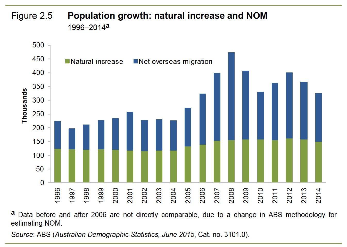
Figure 4: Figure 2.5, page 68, Productivity Commission Inquiry into Migrant Intake into Australia, 2016
Or, if you’re the dunce of the class and aiming for a ‘D’, then you could do what the Australian Bureau of Statistics do themselves in their official pdf explanation for Series 3101 on Australian Demographic Statistics. They just use a tiny little gap in the line, as well as adding a footnote at the bottom of two other footnotes. Why is that a D? Because for anyone who has a modicum of common-sense about them (let alone those of us who paid attention when studying science, or stats) would know exactly what a gap in a line in a graph should represent. You got it, a gap. A missing data-point in an otherwise consistently recorded and defined stream of data. So when normal people read ABS charts that have been cut-and-pasted by unscrupulous journalists at trashy magazines (in this case David Scutt at Business Insider Australia) we all get absolutely the wrong impression.
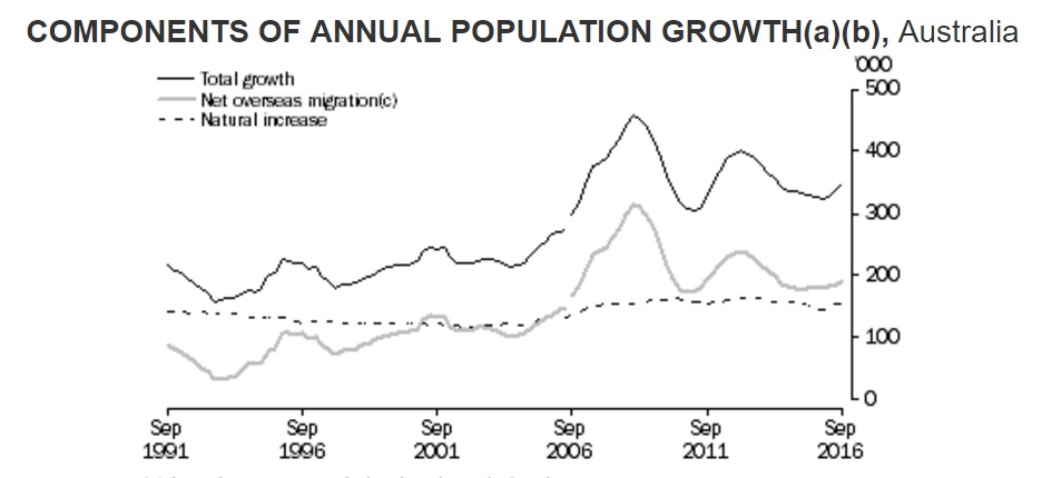
Figure 5: ABS excerpt published in Business Insider, 2017
Of course, Business Insider isn’t actually that trashy, and I doubt David Scutt is always so unscrupulous. But in this case they’ve let readers down, since journalism should be about holding authorities to account, not mindlessly regurgitating the most careless of their work.
But they’re hardly the worst. A step worse than failing would be absolutely not caring (or realising?), and presenting the data without even the slightest gap, footnote, or explanation. Like the Reserve Bank of Australia did in August 2015, in the Statement on Monetary Policy. The National Australia Bank does exactly the same thing when they produce reports on Population Growth, as did Gareth Aird from Commonwealth Bank recently. Just as wrong and definitely not caring about it are all the property market data traders, like Core Logic, who produce graphs like this all the time:
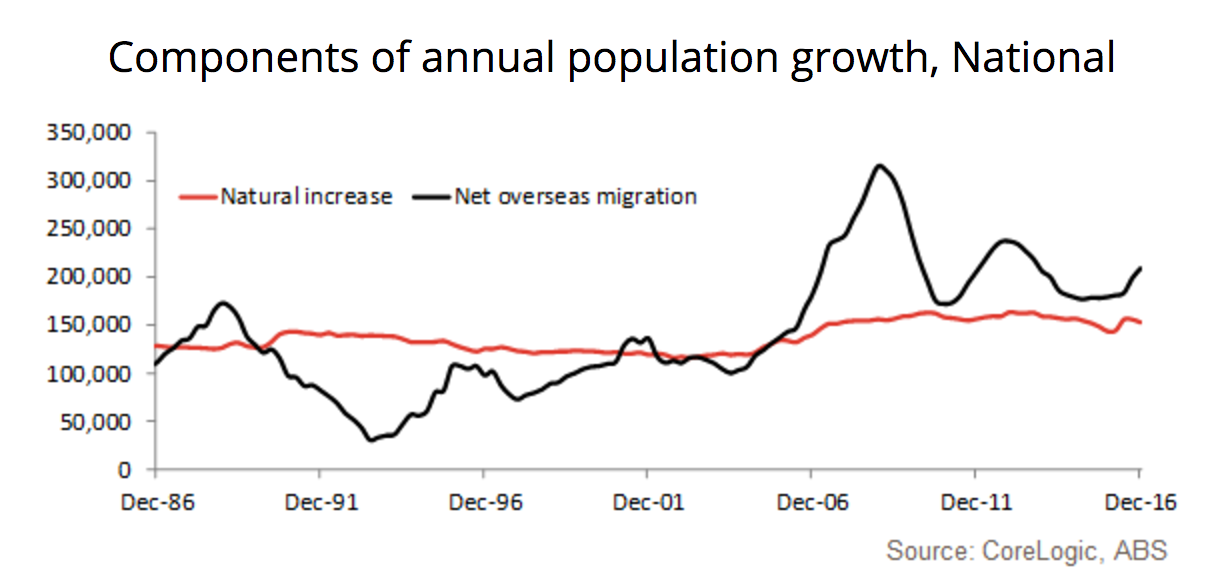
Figure 6: Core Logic Blog, 2017
Bernard Salt, the KPMG partner who specialises in demography (and frequent demographic columnist for The Australian) also falls in the ‘don’t realise, or don’t care’ category. Happy to footnote an annual estimate made on three quarters of data, but no mention of the definition shift in 2006.
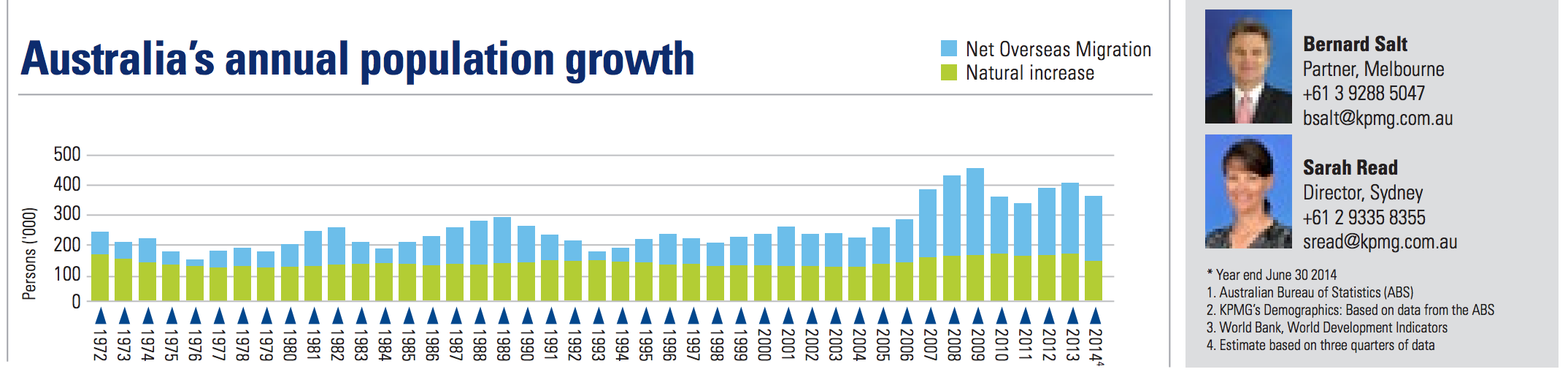
Figure 7: Extract from KPMG Immigration Infographic
And even worse than being accidentally oblivious to the error once or twice, you could be really loud obnoxious, and incessant about repeating the error, and all the incorrect conclusions you could draw from it. Here the gong has to go to Leith Van Onselen from Macrobusiness, who has to be the head cheer-leader for the very small clutch of economists indulging in this dalliance with the ‘Population Ponzi’ explanation for the mediocre economic performance of our economy. In a trend that saddens me for a fun, insightful business blog which I otherwise love reading and pay money to subscribe to, Leith is slowly turning half of Macrobuiness into a thinly econo-veiled anti-immigration rant. And he wheels out this graph and state-based ones (and longer ones with even more, larger definition shifts) again, and again, and again, and again to explain every imaginable economic ailment from low wages to crowded trains.
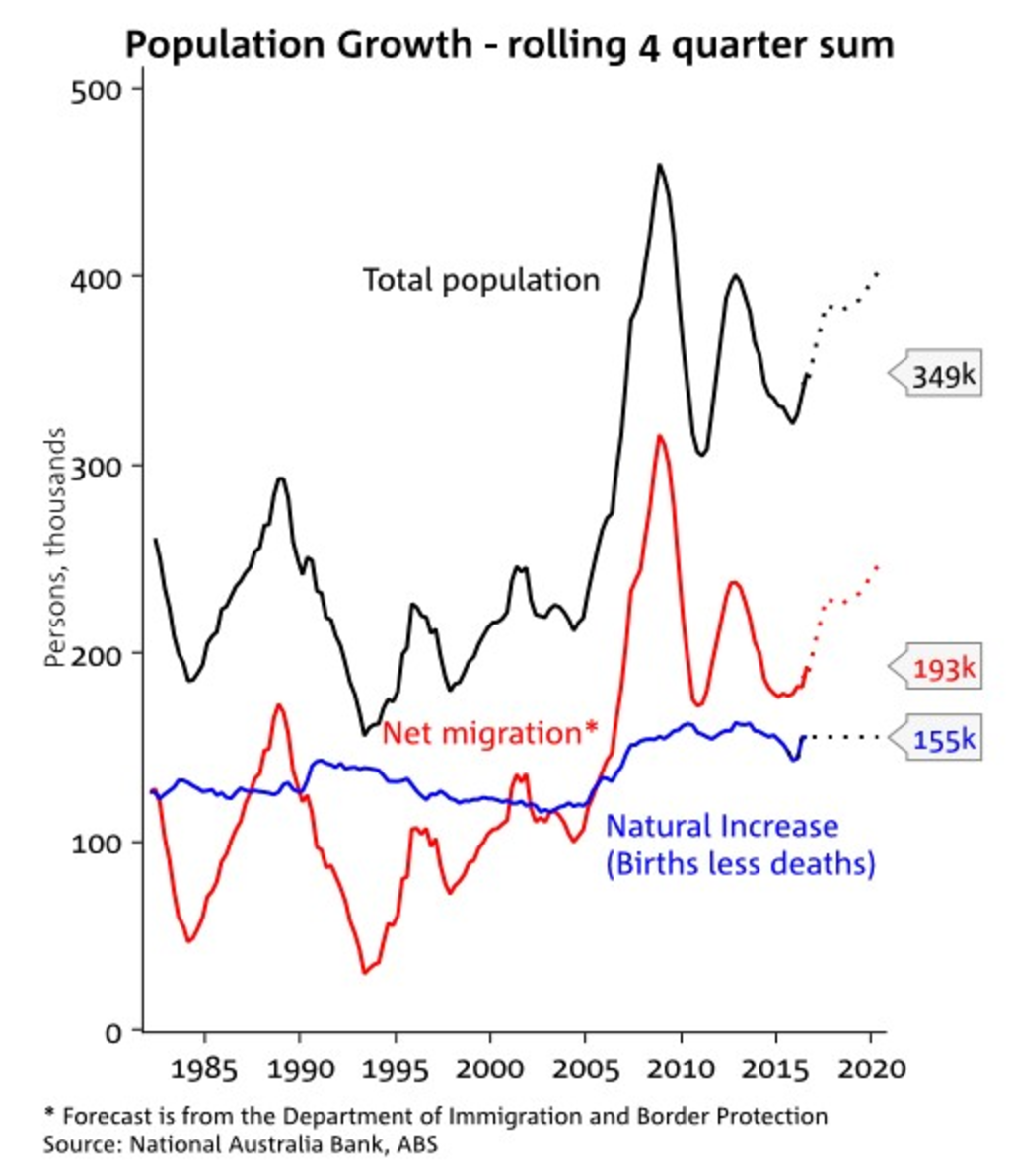
Figure 8: Macrobusiness reposting a NAB graphic, 2017
If it’s broke, should we fix it? The statistician’s dilemma.
So apart from being sloppy, this definition shift conceals something pretty serious, a divergence from a more important series which Australians ought to know about.
It’s worth asking what motivated the ABS to make the change in the first place. Changing a definition in the middle of a series is pretty mortifying to serious analysts trying to draw conclusions from it. There must have been something pretty traumatic going on to justify such drastic measures.
In their defence, arguably there was. Here’s the monthly arrival and departure series showing tremendous growth, almost doubling in ten years, around 7% compound rate:
Figure 9: The exponential growth in monthly overseas movements
And here’s how that nets out:
Figure 10: The increasing volatility of net monthly overseas movements
The mid-2000s saw a gear shift in the amplitude of seasonal fluctuations in what I might call the ‘physically present population’ (PPP), as well as acceleration in the total number of trips. People were traveling more frequently, and that meant that the 12/12 rule, which required people stay here (or stay abroad) for 12 months continually wasn’t being triggered as reliably.
In theory, a new migrant to Australia could go home for a couple of weeks every Christmas, they’d never actually ‘arrive’ according to the definition used in ABS’s 310101 series, because they never spend a continuous 12 months in Australia. Surely that’s a loophole worth closing right? If that was happening with a substantially increasing frequency, (and one could see how new droves of international students, working holiday makers, and 457 workers in the mid 2000s that it might) then you’d think that we’d run the risk of recording a substantially smaller ‘resident’ population than we actually physically have here in the medium and even longer term. That could be problematic, and the ABS sensed the issue before making the change.
Having already crossed the data-wrangling moat around the Arrivals and Departures comparison, we can easily extract consistently recorded time-series of net movements, expressed as an annual rate, recorded quarterly, which we can compare with the Net Overseas Migration Number in 3101. As at June 2006, you can see what the ABS was worried about:
Figure 11: The link between NOM and Movements was clearly broken by 2006
The striking thing here is that the two series had indeed departed, but in the opposite way that one might suspect. Contrary to what I might have guessed, in the early 2000s, Net Overseas Migration began substantially over estimating the actual net change in people present in Australia. To simplify and stereotype, the new migrants who flew home for Christmas and never officially ‘arrived’ according to the 12/12 rule were starting to be heavily outweighed by the Australian expats who flew back every Christmas, and never ‘departed’.
Why did we ever start with a minimum stay incorporated in the definition of ‘migration’? Arguably it might be useful if it helps to iron out some of the volatility. If travel patterns are reasonably stable, you could draw a line somewhere that might work. And up until 2001, that’s broadly what the NOM measure achieved, reduced the peaks and troughs a bit. But travel patterns were not stable in the long-term, and by 2006 with the ‘physically present population’ was now a hefty quarter of a million people smaller than what the official ‘Estimated Resident Population’ recorded in 3101. With no sign of a reversion occurring, it might have seemed necessary to shift the definition to maintain the credibility and usefulness of the series.
So by shifting the definition of what constituted an ‘arrival’ or ‘departure’ for migration purposes to include any movement that was followed by a cumulative total of 12 months in the next 16 spent in or out of Australia (including multiple trips) the ABS hoped that the rapid accumulation people who are theoretically ‘resident’ but in practice not present.
Did the definition shift have the desired effect? Well, fleetingly, before it failed even worse than ever…
Figure 12: The gap between NOM and Movements widens after the definition change and the GFC
Arguably it might have helped, for a moment, to at least stem the explosion of the discrepancy between the two series. But what’s obvious in hindsight has come back to bite: travel patterns had to stabilise somewhat for any arbitrary definition to work. Which is why it did work, fleetingly, when travel growth did stall for a moment, at the peak of the Global Financial Crisis when the Aussie Dollar plummeted, as you can see from this graph smoothing out arrivals and departures over 12 months. (Zoom in on the bottom to check the difference between the two line, plotted in bars at the bottom. I think appreciating the scale difference is important.)
Figure 13: International travel slows during the GFC, even more for departures
But afterwards it accelerated again with new vigour, and the gulf between net movements and official ‘Net Overseas Migration’ opened wider than ever before. Even if the ABS was catching the expats who came home for Christmas, they were being rapidly overwhelmed by the droves of people spending months in the year away for all sorts of exchanges, holidays, business trips, secondments, backpacking, GAP years, conferences, family visits etc, but still managing to clock up more than four months in any given 16 back in Aus.
The sojourn-slump we call a migration spike
It’s also worthwhile just noting how that graph up-ends the common narrative of an immigration spike. There wasn’t an influx of new unfamiliar faces flooding into Australia. The new ‘immigration’ was driven by all the familiar faces who stuck around much more than they might have otherwise.
That’s hardly surprising given that Australia’s was the only Western Economy which wasn’t in recession at the time. Earning money elsewhere would be hard. And with the dollar sharply depressed, spending it elsewhere would be dangerously easy. Little wonder plenty of Aussies would have postponed trips overseas for work and pleasure alike. Similarly, foreign students and backpackers might have decided against taking holiday breaks home to join their families in deeply depressed economies. Spending some foreign currency on a cheap summer in Aus would have been a pretty appealing alternative.
The fallout from a failed rescue
So what’s the upshot of the ABS persisting in using the arbitrary and inadequate definition of Net Overseas Migration? Simply that no-one is keeping track of a far more reliable, rigorous, and consistently defined alternative: Net Overseas Movements.
Guessing about what people’s travel plans are is ambitious. Guessing where people will actually travel is vastly more so. So trying to define ‘migration’ on the basis of some rule that gives an indication of where people will probably be, more often than not on average, for the medium-ish-term future is utter folly. The ABS has been trying to pour concrete around their code for tea-leaf reading. It’s necessarily arbitrary, subjective, and continually subject to the tides of change in human behaviour. Every few years they’ll have to break up the concrete and pour it again, like they did in 2006, and try to do it quietly enough that we won’t notice. Apart from the waste, the casualty is the quality of our nation’s economic planning and analysis, which is anchored to a tenuous, distorted time-series.
On the other hand, being an island nation makes the act of crossing a border one of the easiest, most clear-cut, comprehensively collected statistics that we could ever hope to encounter. Unless we believe that thousands of people are leaping past the customs gates at airports, or that the thousands of boat people land on our shores (and integrate into society) completely unnoticed, or that every trade-ship is packed full of stow-aways, then movement numbers collected by our border authorities should be about as hard and fast as statistics can come. And unlike almost every other stat collected by ABS, we actually measure every one of them, not just imputing from a sample that we asked to fill in a survey.
And if we take Net Overseas Movements as a metric for migration, a very different story about migration rates in Australia emerges.
Here’s the Net Overseas Migration rate, with a polynomial, and linear trend fitted:
Figure 14: The official NOM figure shows long-term acceleration of inward migration
It’s easy to see how people would still attain the impression that Net Migration has increased. Taking a linear trend you would assume that we’ve risen from an average migration rate of under half a percent to nearly one percent of population. That’s quite something.
And here’s the Net Overseas Movements:
Figure 15: The figures on total Movements shows no long-term trend
No, your eyes aren’t deceiving you, that’s actually a slight downward slope. It’s a volatile, cyclic series that is essentially unchanged in terms of level for nearly 40 years.
The consequence of such a shift is also pretty dramatic when you consider how that might impact the overall population. The cumulated impact of this variance is now enormous, about a million people, who are officially counted as being ‘resident’ but physically aren’t here in Australia:
Figure 16: The cumulative discrepancy between official NOM and the population actually in Australia has exploded
The Missing Million
This also has a pretty dramatic impact if you calculate an alternative population, which would be the “Physically Present Population” (PPP). Using the arbitrarily defined estimate we call ERP is the equivalent of pretending that we have another two Tasmanias worth of people dangling unnoticed somewhere off the coast of Australia. But those two Tasmania’s worth of people will be roughly as rich and productive as the average Australian, i.e. much more like New South Wales and Victoria.
I can’t see any reason why we shouldn’t pay more attention to that the PPP number. Combining the rigorous, cleanly defined, universally collected Net Overseas Movements with Births and Deaths (also binary, one hopes comprehensively recorded) would produce a time series we could all have confidence in. Furthermore, we could release it monthly or quarterly with almost no delay, rather than waiting for the full 16 months required for Net Overseas Migration to be calculated and amusing ourselves in the fog of confusion created by all of ABS’s opaque estimates and projections in the time-being. Here’s what such a series would look like, plotted quarterly, but calculated as the sum of the previous 12 months:
Figure 17: Natural growth actually comprises over half of our population growth
This suggests that in recent times ‘natural’ growth (births and deaths) has actually outstripped migration as a contribution to our overall population growth. In stark contrast to the story which is usually told from the graph below:
Figure 18: The assumption that migration drives population growth arises from arbitrary, inconsistent definitions of Net Overseas Migration
And here’s the comparison the two when expressed as a rate, side by side, with some period averages calculated:
Figure 19: The population growth rate may actually have fallen since 2000
Now the baselessness of the Population Ponzi story is exposed. We’re not importing masses of people just to delay the impacts of population aging, so that a later generation can deal with that problem. We’re getting new people on long-term visas to replace the rising fraction of Australian’s population who are possibly still long term - but increasingly ‘part-time’ - residents. The Net Overseas Migration metrics have completely failed to capture the correct story.
In a generous moment, I might concede that the arbitrarily defined NOM might still be interesting to track for some purposes, for example in property prices. Aussies are likely to hold onto their homes even while they spend more time overseas (often leaving them empty), and an investor who spends little time here can push up property prices. But the moment someone starts claiming that immigrants are congesting our roads and there’s no way we can build enough infrastructure can keep up with their rate of arrival, (see Cory Bernardi and Mark Latham here) it’s time to grip your sides and start rolling around in the aisles in laughter. That particular rate of growth has unequivocally slowed. People who are overseas don’t drive their cars on the M4 in Sydney, or cram up the train stations in Melbourne.
It’s also ridiculous that the million officially resident - but presently absent - people constitute a “growing reserve army of labour” who are bidding down the wages of local workers. The army that exists in the real statistics is the million non-present residents, many of whom are probably busy chasing higher incomes (or spending them) - but overseas.
The mind boggles at the slew of other statistics that this could seriously affect if the ERP was replaced with PPP. It might explain the consistently disappointing nominal GDP growth that Australia has been experiencing for some time, which assumes that a comfy 1.5% growth can come from population increases before any productivity is added. Plenty of labour statistics are bound to be out as well, since surveys of local addresses wouldn’t tell us much about how hard all non-present residents actually work (or what they earn) while they’re not here. But ABS scales up the results, using ERP, effectively including them in the labour force. Lacklustre wage growth, productivity figures, poor tax revenue, almost everything that the government relies on to make proper policy decisions could be woefully distorted. Exploring that mess will also have to wait until a later post.
It’s also perfectly possible that plenty of other developed countries have also been effectively double-counting an increasing part of their populations. In my searching of ABS definitions, I found no mention of needing to adhere to any international rules or standards to ensure that the world’s population added up. Perhaps the miscounting of populations could be added to the list of possible explanations of low-growth in the Western World.
But before signing off for now, I’ll have one more dig at the ABS, this time for a nasty twist that emerged late in my research for this post, when trying to get confirmation of my hypothesis from the recent Census. Yes, it turned out I was naive again, nothing with an ABS stat is going to be quick. The obvious numbers from ABS Quickstat for 2016 and 2011 (“Persons count based on place of usual residence on Census night” known as PURP, which I’ve plotted below) actually aren’t directly comparable to either the ERP or PPP. But finding the ones that are turned out to be, well, not that easy, particularly if you don’t trust ABS estimates or imputation. Let’s just say that ABS knows what it’s like to realise they’ve been over-estimating population by a few hundred thousand people. Last time that happened (in 2011) they smeared the error out over the previous two decades so that no-one would notice. Unpicking the possible distortions that that might have sewn into all these figures, and relating it to the observations above will occupy the subject of another post soon.
QQ.
Figure 20: An assortment of alternative population measurements
The .Rmd file for this post can be accessed here, which will require the installation of this package to run.