
It would be nice to think that the Census was a good strong anchor to Australia’s demographic statistics. Every five years we lavish our statisticians with enough of a budget to attempt to poll 100% of households, rather than trying to extrapolate from tiny surveys and samples. It’s a chance to peer into some of the more detailed aspects of our demographic composition, including how many languages and bedrooms we have in our homes. But far more importantly, the Census acts a stock-take of our countries most important asset: it’s people. Every month or quarter we employ statisticians to collect and publish the data on all the ‘flows’ of people, their movements in and out of the country, and their births and deaths. But to arrive at a total number of our stock (population), we rely on some anchor-point: a some starting level, or an occasional measurement on the entire stock. That’s what the Census is. Australia is like a company that conducts millions of transactions each year and has an accounting department keeping track of the Profit and Loss (P&L) report every month, but is only able to get a bank statement every five years to confirm that the dollars we think we have are actually there so we can make a solid report of the Balance Sheet.
What was the result of the last Census? The headlines will tell you that the confirmation was achieved. The Estimated Resident Population (ERP) was 24.25 Million as at the 9th of August, only a whisker away from the 24.31 million that the P&L report (series 3101) reported at the time. However, as I’ve noted at some length in an earlier blog post ERP has quite a bit of baggage, particularly associated with the definition of the word ‘resident’. Furthermore, in the last ten years it’s systematically diverged from an alternative, less arbitrary statistic which can be derived from ABS numbers, the Physically Present Population (PPP), which was now about a million people lower than ERP.
The unspoken news is that the last Census published a result which is severely inconsistent with the observed flows of the PPP. Why is this big news? Because the numbers that make up the PPP actually sit upstream of the ERP. PPP is the hard number, ERP is a derived number which relies upon a bunch of arbitrary classifications of people being ‘resident’ when they’re not actually here, and not ‘resident’ when they are. If you don’t know where people are with any confidence, you can’t claim to know even the starting point for figuring out whether they’re resident. It’s a “rubbish-in, rubbish-out” type of relationship. It’s possible that one can coincidentally (or deliberately) arrived at a confirmatory result of the derived figure (ERP) by using all your fudge-factors and definitional adjustments to bury the contradictions and inconsistencies in your PPP. That would be a really bad statistical result.
It seems that in this respect the Census may have actually failed, and successfully disguised its failure. Or, if we take it at face value, the Census is telling us that around 350,000 people (more than the population of Canberra) somehow slipped into Australia without passing a customs gate since the last Census. Or alternatively, that 350,000 babies were born “off-grid” in the last five years, without getting a birth-certificate, but still made their way into households that filled in a Census form, or should have. (I.e, they’re not living in some massive un-noticed commune in the outback.) Unless there’s some considerable mistake in my working below, (please let me know if you find one, I’d love to hear) the ABS has no idea how many people are here to the level of accuracy that they claim. Which means that no-one does, which can’t be a good thing.
Check out my working below, and get ready to dust off some conspiracy theories about who hacked/botched the Census, and why, if you think my working holds.
Digging up the data
In an earlier blog post I challenged the notion that Australia’s migration rate is as high as it actually seems, by pointing out the widening gap between the officially reported Estimated Resident Population (ERP) and the Physically Present Population (PPP), as derived by summing all births, deaths and overseas movements, irrespective of visas, length of stay etc. Here I want to follow up by seeing whether the Census held last year confirms or rejects my view that our perceived population growth might be overstated.
In a teaser for the topic, I posted this graph, which shows how the ERP and PPP compare to two census figures for the PURP, (the count at the Place of Usual Residence).
Figure 1: An assortment of alternative population measurements
Whilst this seems to show some support to the idea that the ERP might be overstating things, I acknowledged at the time that PURP didn’t technically correspond properly to either the ERP or PPP. Some deeper digging was required to find out exactly which measurements from the census actually would.
The relevant tables which outline the actual calculation of all the different components can be found in these links for the 2006, 2011, and 2016 Census results.
I manually copied the data just for the Australian totals into a table, negating interstate movements (which net to zero).
Figure 2: Some Headline Census Population Statistics
This chart shows that the Estimated Residential Population is consistently much higher than the number of people who are actually counted on Census night. The difference between these figures can be explained by the following graph:
Figure 3: Census Population Statistics Adjustments
These smaller numbers explain all the adjustments between the different higher numbers. The process goes something like this:
First you count the number of people who are present actually present at that actual location. (This is called the count at place of enumeration.) Subtracting the number of people who are present, but not ‘usually’ living in that place (overseas visitors) gives the ‘count’ of people in their usual place of residence (PURP). (If you’re concerned about the populations in different states or cities, there’s an additional adjustment here for that.) However, to reach the Estimated Resident Population (ERP) which we use for our standard measure of population, the ABS adds back in all the ‘residents’ who are judged to be ‘temporarily’ overseas (over 600,000 of them, roughly double the number of foreigners temporarily here) as well as an additional adjustment for ‘under-enumeration’, short for “ummm… probably we missed some, add a few more to be safe.”. (I jest, it’s not that simple.)
What seems particularly interesting is the rapid decline in the under-enumeration adjustment, as well as the dramatic increase in the number of residents ‘temporarily’ overseas. The latter is not surprising. As I’ve outlined extensively in an earlier post, Australia has an increasingly part-time population, with overseas travel skyrocketing, and the Census strongly confirms this observation. (Or rather, relies on it.) We’ll come back to the under-enumeration a little later.
However, armed with these different statistics, it’s possible to reconstruct census-based statistics which correspond to the Physically Present Population, as I’ve defined it. We simply count all the people who were physically here (or assumed to be), but only those who are physically here (or assumed to be). That means we include the under-enumeration and demographic adjustment, but don’t add or subtract any foreign visitors or residents. This particular combination isn’t actually added up as a total in any of the earlier reported headline statistics, but we can re-create it. Hence-forward we’ll refer to it as the Census PPP, as this is what it should correspond to, though in Census-speak it would be called the count at place of enumeration adjusted for under-enumeration and demographics, but not visitors.
Figure 4: Some Headline Census Population Statistics, with Census PPP estimate added
Unsurprisingly, the PPP is somewhat underneath the ERP. This shows the gap to be about 320,000 people, with the PPP at 23.93 million not that far below the ERP at 24.25 million. But this seems to fly in the face of the observed discrepancy between the ERP and PPP that’s derived from Series 3101 and 3401:
Figure 5: The cumulative discrepancy between official NOM and the population actually in Australia has exploded
A foible that was found, forgiven and forgotten
So, at face value, the Census seems to contradict my earlier observation that there was a cumulative discrepancy of about a million people. But it’s worth asking the question, how is this the case? Let’s go back to the comparison with the quarterly data-series of ERP, and my comparison with PPP:
Figure 6: ERP series, PPP, and the Census PPP observations
At a glance, this doesn’t tell us a lot. The ERP from Census was a bit high in the 2006, and a bit low in 2011. However, that’s probably to be expected given the massive intercensal error which was noted in that period. But the scattering of the census points makes them impossible to compare with the changes implied by the time-series. What I’m keen to check is whether the lines of the more frequently recorded series can plausibly link up the other level-shifts between the census periods. Or, is the change in level measured by the Census at least consistent with the measured flows that were observed by the time-series in the intervening time?
Let’s focus simply on the ERP and PPP, since these are the only two comparable series and observations. To conduct the test, let’s index the 2006 observations of both statistics at zero (for both the Census and time series, as of September quarter), and see how the subsequent changes track over five years, and how close the running series come to matching the Census observations. We might call this just a plot of ‘Intercensal Population Growth’. (Technical note: since the 3101 series is quarterly and the 3401 is monthly, I’ve entered the quarterly change here due to net overseas movements as being 25% of the net movements in the previous 12 months, effectively smoothing out any seasonal fluctuations.)
Figure 7: Intercensal Population Growth between 2006 and 2011, shows an ERP discrepancy between 3101 and the Census
This shows that the Census ERP was quite a bit lower than the series would have seemed to suggest it should be given the previous year’s starting point, but we know that this particular year was the time when an improvement in methods meant that a systematic error that could have been incorporated in all previous years was omitted. It’s not good, but at least it’s known to be not good, and openly discussed as such. It would look substantially worse if the error hadn’t been smoothed out over the previous 20 years in the time-series. However, the good news is that the error in PPP, which is the harder number that lies up-stream of the ERP is (relatively) small (well, within 50,000, or ~3%). In other words, the larger error in ERP can be made up/accommodated by stretching a little bit all those fudge-factors around how ‘Resident’ is defined, which as I’ve laboured before, are inherently arbitrary and opaque and has shifted in definition quite a bit in the past. This makes starting levels opaque and uncertain. Since the births, deaths and movements are come kinda-sorta close to the change implied by the Census count, that means that no particularly abhorrent violence to our system of mathematics is required to accommodate the error. Past errors and uncertainties come close enough to explain things.
The massive fault that was papered over, and never noticed
The subsequent intercensal period, however is different.
Figure 8: Intercensal Population Growth between 2011 and 2016, shows a PPP discrepancy between 3101 and the Census
Now the table seems to have turned. The ERP is back on track (at least as far as the reported change is concerned), but now there is a massive discrepancy between the change in PPP recorded by the time series, and the Census. This time the difference is 346,375 people, or a whopping 23% of the change during that period.
This is seriously worrying to see such a miss-match in these sort of numbers. Either the previous Census way out, or this Census is way out, or the time-series in the time period intervening is way out. The latter seems the least likely.
Of all the time-series that the ABS records, only a handful are consistently produced from a continuously comprehensive measurement of the source, rather than extrapolated from small, intermittent surveys. Births, Deaths, and Overseas Movements are three that spring to mind. Physically Present Population (PPP) is derived from these alone. Unless there are large numbers of border crossings that aren’t recorded by customs (which would be a national security disaster, amongst other things), or a large number of home-births that never get recorded, or a large number of murders/missing persons who are also never reported, an error of anything like 300,000 people over a five year time-period is virtually unthinkable. GDP, inflation, savings rates, basically everything else the ABS does has a really significant potential for some sample error, which could become relatively large by extrapolating to the whole population. But Births, Deaths, and overseas border crossings are as hard a statistic as one can find. There appears to be hard evidence that either those numbers, or the difference between the counts of two Censuses, are out by over 300,000 people. Which leads one to ask the next question obvious question: how much uncertainty can there be in a Census?
Introducing the Census, Post Enumeration Survey (PES) and the Net Undercount
Happily there’s a nice 80-page report called “Report on the Quality of 2016 Census Data”, produced by a group called “Census Independent Assurance Panel to the Australian Statistician”. Sounds like exactly what I’m after. The group includes a clutch of important sounding people, judging by their professorships and AM/AO titles, and on the first page of the Executive Summary conclude that:
The Panel has concluded that the 2016 Census data is fit-for-purpose and can be used with confidence. The 2016 Census data is of comparable quality to the 2011 and 2006 Census data.
Being one of the few people who’ve taken the time to attempt to grapple with how the 2011 Census data proved that the 2006 Census included a flaw which resulted in such a large intercensal error (~350,000 people) that the difference was agreed to be smudged over 20 years, and still resulted in a large discrepancy for 2011, that’s not a statement that fills me with confidence. If we’re not aiming for better than those years, we’re not aiming for much at all.
But the report is well laid-out and does a decent job (I think) of explaining all the different elements that go into the Census statistics, with plenty of focus on the total population count, in particular the process that is used to derive the ‘Allowance for under-enumeration’, or the “ummm…. maybe we missed some” factor.
The good news is that there’s a process, the bad news is what the process involves. To arrive at that seemingly small adjustment of 226,500 people (actually this more detailed document specifies that it is 226,407 people) there are few steps that need to be undertaken. In truth, of the 23,397,296 ‘usual residents’ of Australia that the Census counted on Census night, a full 1,183,519 of those people didn’t actually respond to the Census, rather the ABS ‘imputed’ them into dwellings that didn’t respond. That’s around 5% of the population we’re supposedly trying to ‘measure’. I don’t blame the ABS for using imputation, but I think it’s important that more people understand just how blunt are the tools that the ABS is forced to work with. (Though I think there could be some ways to sharpen them.) It came as a surprise to me to learn that the most basic ‘count’ that the ABS reports from census includes over a million people who were never counted at all. They were simply assumed to exist, or ‘imputed’.
Happily there’s a process for testing how well this ‘imputation’ worked, as well as identifying other potential errors (such as people including people in the household who shouldn’t be counted, or not including those who should be). That process is called the Post Enumeration Survey (PES). It’s a survey of 50,000 dwellings (or 0.5%) that takes place soon after the Census period. (Normally 4-5 weeks after Census night, 9-10 weeks in 2016.) The ABS conducts this survey by phone or in person, where they try to establish as best they can who was eligible to be counted in the Census in that dwelling, and whether they actually were counted in either a returned form, or by imputation, correctly.
(As an aside, my research has revealed that efforts to assess imputation were only commenced in the 2006 census, prior to this imputation was assumed to be as good as any other returned form. It was and probably still is actually undercounts on returned forms that form the main motivation for the PES.)
That survey of 50,000 dwellings (of which 42,463 responded) is then used to derive estimates for a series of ‘overcount’ and ‘undercount’ adjustments that goes something like this:
First there’s the ‘Gross undercount for people on Census forms’, which are the people who should have been included in a form that was returned and weren’t, or were in a dwelling that wasn’t known to Census, and never got a form. It’s mainly due to people mistakenly not recording someone, thinking they weren’t meant to be recorded, or would be recorded somewhere else. In 2016 that was 1,018,775 people. Yep. Another million-person error. (Why all these numbers are to six or seven significant figures when the survey was of 0.4% of the target population, I have no idea. Heavy sigh.)
Next is the ‘Gross overcount for people on Census forms’. This one is for people who are included on multiple forms, or multiple times over by error, which amounted to 302,194 last Census.
Those two numbers net out to a ‘Net undercount for people on Census forms’, or 716,581 people, or 3.0% of population.
The Achilles heel
Finally we come to the “Net overcount for people imputed”. This, for me is the really important part, and where I take massive issue with the adequacy of the method, but we’ll come back to that later. The result: 490,174 net overcount for imputed persons.
That’s a staggering figure for a couple of reasons. Firstly, it means that nearly half of the million-odd ‘imputations’ were wrong. In fact, given that there isn’t any gross undercount and gross overcount for the imputed persons (there were bound to be a few households where not enough people were imputed, so extra under-imputations above 490,000 would be inevitable) the true error margins are probably even higher. This figure assures us that that the process of imputation is no better than a coin-toss.
Secondly, this figure is nearly double what it was five years ago. The report includes a note that the ABS found that “the process of determining whether a home is occupied on Census night or not has become much more difficult with the increase in the number of people living in high-density, secure buildings and the decreasing likelihood of making doorstep contact.” That’s probably both true and fair, but it doesn’t detract from the increasing level of uncertainty that we actually have about the statistics. The summary as far as the trajectory is concerned tells a very different and alarming story, as this table shows:
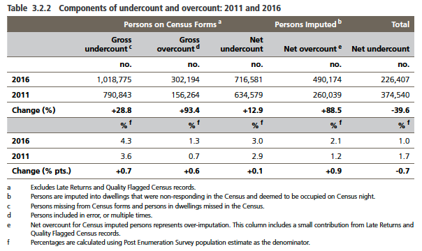
Figure 9: While the Total Net Undercount seems small, and falling, the cancelling errors which lead to it are large, and growing
So whilst we get the appearance of increasing certainty and accuracy from the most recent Census, in truth all of the measurements actually have decreasingly accuracy, but the errors cancel in such a way that the ‘net’ error seems small. Who knew?
Oh, for a stated sample size
Even more worrying (perhaps) than the number of false imputations is the process used to arrive at that number. Less than 5% of dwellings who were thought to be occupied on Census night didn’t respond, despite all the reminders and visits, so the component of the Post Enumeration Survey who represent that imputed part must be roughly a similar proportion if they’re independent. That’s ~5% of a 50,000 household survey, or perhaps 2500 households. Appendix B in this document informs us that actually only 42,436 households responded to the PES, so that fraction is likely to be closer to 2,100.
However, that’s just me taking an equal proportion of each sample, under the naive assumption that there’s no correlation in those groups. In actual fact, what we’re talking about is an attempt to get an accurate sample of the group of people who didn’t respond to a letter, phone-call or visit to prompt them to return a census form, by giving them a phone-call or visit nine or ten weeks later. The potential for sample bias here is enormous, particularly if the part-time population that I’ve discussed earlier is actually at work. A large and increasing fraction of Australians spend a considerable amount of time overseas, but are still officially ‘resident’ since they don’t spend more than 12 out of any 16 overseas. So, the people who don’t respond to the Census but are imputed, and also aren’t found by the PES (which can’t then confirm them as an overcount) are potentially a large, and highly correlated group. Many of them could be the same people, on the same trip overseas. Whilst discussing the possibility that they are correlated in Appedix B, the assumption that they aren’t significantly correlated is illustrated throughout the report and surrounding literature. It’s particularly openly displayed in a table in the Appendix A of the report:
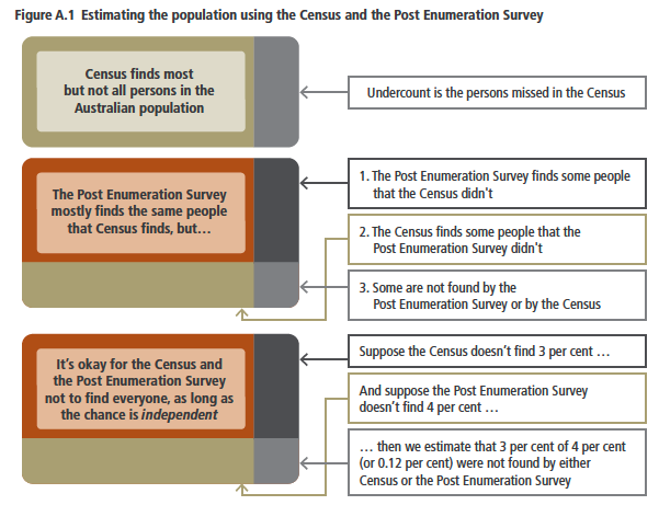
Figure 10: ABS expressing the assumption that non-respondents to both Census and PES are independent
Here, the ABS openly claims the assumption that the probability that someone responds to the Census and PES as independent. But it’s plain to see that if these non-respondents include a significant group of people who are overseas for a bit more than a month at a time, (and we know that kind of travel has increased dramatically), then that assumption will absolutely not hold. In fact, a significant component will be as far from ‘independent’ as possible. They will be EXACTLY THE SAME PEOPLE.
To Find, or Un-find? That is the question…
This possibility of correlations two non-response groups is described clearly and accurately in section 3.2 of Appendix A, on page 52, which covers “Correlation and non-response bias”. However, the report firmly states that this possibility leads only to a potential underestimate of the population. The language that’s used makes it clear that the ABS is (understandably) worried about the same set of people ‘not being found’ in either the Census or the PES. It’s cute that we’re so concerned about making sure that everyone gets counted, but the concern for representation masks a glaring and terrible logical error that’s brought about by imputation, which could seriously affect our headline count. There’s over a million people who are ‘counted’ in the Census who were never actually found, they were put there by imputation. Hence the role of the PES turns out to be actually to ‘un-find’ them, essentially prove that they weren’t actually here, and should never have been found in the first place. This means that in the presence of such heavy imputation, and known over-imputation, correlation in a group that is ‘not found’ in either the Census or the PES can actually lead to an over-estimate, since we could be failing to ‘un-find’ people faster than we’re failing to ‘find’ them.
But wait, there’s more…
There’s also reference in this section to further research and another mathematical model that has been made to help account for the possibility of correlation (created just after the 2006 Census), which you can find here. It’s even more weighty, but it carefully describes a process that doesn’t do anything to address the sort of bias that would arise from people being overseas during both the Census and the PES. The two key sections that make that explicitly clear are here:
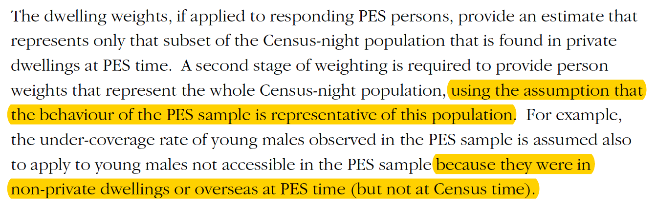
Figure 11: The ABS has attempted to create a model to determine the likelihood of people not responding to the PES
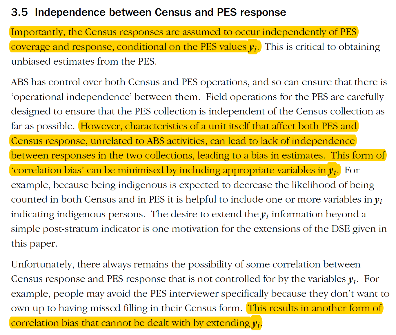
Figure 12: The method that is used still relies upon the independence of the PES and Census responses, which would fail when one person is overseas for both
Helpfully this paper points out exactly what their model can and can’t do. What they can’t account for is respondents who don’t respond to one survey because of the same reason that meant they didn’t respond to the other one. The person who feels guilty about missing the Census, and avoids the PES survey as direct result of missing the census, is their example. A person who is overseas at the time of Census, and is still overseas at the time of PES, is exactly the same sort of bias, which can’t be accounted for in any of this modelling.
In short, the Census has a serious blind-spot. The error that was concealed in that blind-spot might not have been that large in 2006, but in that time overseas travel has increased so massively that the error could now be extremely substantial. In a staggeringly poor assessment of this potential error, the report makes this claim:
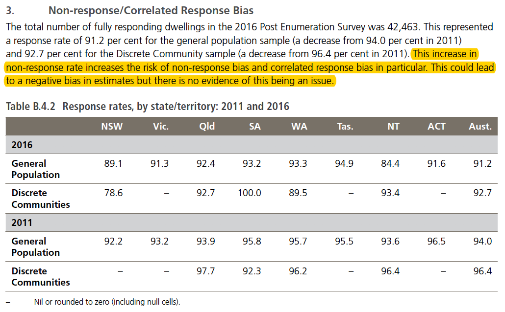
Figure 13: Despite lower response rates, the chance of correlation bias is quickly dismissed.
Not only do they implicitly assume that the bias would result in an underestimate, but they summarily dismiss the possibility that this is significant. However, the table below that statement shows that the level of non-responses is highest in the most populous, long-settled East Coast states lead by NSW (NT excepted, which has a very high Aboriginal population). To me, it’s unsurprising that these states have the lowest responses. Being the principal destinations of international visitors, and having a large share of young, urban, mobile young people around university age, this is exactly what one would expect if rapid increase in international travel is a major factor driving the increase in non-responses. So is the considerable increase across all states since previous years.
The obvious evidence is needlessly obscured
It would be extremely easy to test the validity of my hypothesis by comparing the proportion of the PES responses that correspond to imputed households with the proportion of households imputed in the Census. Nearly 5% of the people ‘counted’ in the Census were counted by imputation, because a non-responding dwelling was deemed (by some unknown process) to be occupied on Census night. If much less than 5% of the households who responded to the PES turned out to correspond to households which were imputed in the Census, this would provide strong support for a large overlap in the two non-responding groups. The imputed households didn’t fail to reply to the census because of some random reason that wouldn’t affect the PES, they were away overseas (and hence shouldn’t have been imputed) and were still overseas at the time of the PES, so were part of the 8.5% of PES households who didn’t respond, and couldn’t ‘unfind’ themselves from the Census.
Sadly this report tells us nothing at all about the what fraction of the PES respondents corresponded to imputed households. This simple fact would shed enormous light on what could be going on in the Census’s biggest blind-spot. For some reason it is completely omitted from any discussion in the 2016 report on the data quality of the Census.
However, those who seek shall find (in even more obscure places). In section 3.2 of the paper discussing the modelling for weighting different groups of respondents and non-respondents to the Census and PES, there’s a clear admission (from 2006) that the weighting of PES respondents favours dwellings that did respond to Census. They attribute this to people being prompted by the PES to return a Census form late, but admit that they have no way of knowing which late forms were actually prompted by the PES. In other words, it’s just their hunch, and they have nothing else to support it. In 2016, where the PES occurred 9 weeks after the Census, a full month after returns were meant to be completed, this phenomenon would surely have been almost entirely eliminated. If only the numbers were revealed in the 2016 paper, all doubt could be removed.
One final further search for clues
And if for a moment you thought that these potential errors were more likely occupied by normal, randomly distributed noise, the following graphs obliterate that idea:
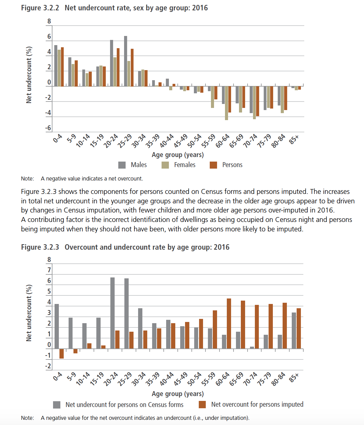
Figure 14: The ABS shows that undercounts and overcounts are highly correlated with certain life-stages
To anyone who’s interested in data-integrity, graphs like this scream out that there’s systematic error present that’s closely associated with life-stages. (As an aside, anyone really interested in data-integrity would demand to know the response rates for each of the imputed bars. Splitting a sample of maybe one or two thousand households into eighteen age groups and two sexes runs the risk of some seriously small sample sizes, so errors could be very large.)
Without drawing too long a bow, one can easily see how this sort of pattern could well be associated with travel patterns. Retirees are likely to travel, but probably less likely to travel for extended periods of time in the same way as uni students, backpackers and young professionals might. In other words, there’s a pretty good chance that those away for the Census and incorrectly imputed would be back in time for the PES, in order to get themselves uncounted. Earlier in ones working life, or during ones study, the chances of being away for more than two months would probably be substantially higher, just as the chances would be even lower still if one is a school-age child.
The extremely large spike for young adults being under-reported in Census forms, particularly males, also could be easily explained by mobility related factors. Temporary workers, students, and backpackers in their late 20s and early thirties will often live in share-houses and might change their living arrangements frequently. It’s easy to see how someone filling in the Census form might under-report newcomers, especially given that the Census asks people to nominate people who are ‘usually resident’ at an address as being there (or intending to be there) for six months or more. To venture a little into the micro-economics of the motives at play, foreigners would probably always feel a little nervous about their status in a country, and avoid over-stating their stay for fear of over-reaching the welcome that their visa officially allows them. For example, if someone was on a temporary visa that was due to expire soon, but intended to extend their visa or change to another visa (such as a Student Visa) they’d be reluctant to state in an official survey that they intended to stay longer than their current visa allowed.
On the other hand, if such people where selected for a PES which was conducted by a person knocking on the door, or even on the telephone, such a respondent would probably be even more reluctant to lie about their intentions to a government officials, particularly if they were in the process of applying for a visa. On review, it’s quite likely they’d be assessed as needing to be counted as ‘resident’, since in retrospect two months of uncertainty would have been removed, and the probability for staying for six months would be substantially increased, or confirmed. All of which is speculation, but provides a better and more plausible fit with the data that’s available than any other explanations that the 2016 report offers (which is none).
A nail in the coffin
If any more evidence was required to support the idea that the the Census could quite easily have errors of several hundred thousand, another curious comment in Appendix B of the 2016 report threw another couple of data-points into the mix that highlight yet another level of uncertainty:
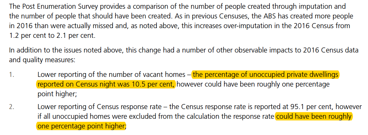
Figure 15: Incorrectly asessing the exact number of unoccpied dwellings has a massive impact
The estimated error in the number of dwellings occupied was around 1% of the private dwelling stock, or 10% of those that were thought to be unoccupied. That’s startling for several reasons. There’s part of me that’s concerned about housing affordability that wants to scream at the outrage of having over 11% of dwellings unoccupied when they are the most costly part of middle-Australia’s consumption bundle, and plenty of people make do with so much less than they would like.
But the bigger concern in this post is that for every non-responding house the Census glanced upon and assessed as being occupied when actually it wasn’t, there were nearly ten other houses that also didn’t respond, but we (still) think weren’t occupied. The other unanswered question is just how many households who were thought to be unoccupied, but then surprised the ABS and returned a form? (Did we even give them a form?) If the net error turned out to be about 1% of households, the gross errors could be substantially larger, and these haven’t been reported.
The consequences for how we treat these statistics is enormous. The report acknowledges that it’s getting much harder to judge occupancy, but the methods used don’t seem to reflect any determination to do anything about it. Startlingly we probably only have a sample of one or two thousand respondents to the PES who come from the imputed category that we’re trying to test for. I wonder whether any respondents to the PES turned out to have been in a dwelling that was deemed on Census night to be unoccupied? Again, we just aren’t told. In any case, one or two thousand is a terribly small sample to conclude that we’re ‘only’ roughly 1% (90,000 dwellings) off the mark in our occupancy estimates. What confidence do we have that it might not be 1.5 or 2%, or even more?
Also, this little scrap of data gives us a tiny insight into how the over-imputation actually took place, so we can start to fill in the types of over-imputation that occurred. If only 1% of private dwellings were mistakenly thought to be occupied, that’s probably only around 90,000 dwellings. To account for the nearly half-million people who were over-imputed, far more than the average household size (2.6) would have had to have been imputed into these houses. In reality, what this actually tells us is that roughly half of the over-imputation was in houses that were correctly identified as being occupied, but too many people were imputed into them. So it’s clear that the imputation process is both not great at figuring out when a house is occupied, but also not good at guessing how many people should be inside. Moreover, from the distributions we do have, it seems that proportionally more people were over-imputed in the oldest age-groups. Maybe the Census didn’t factor in divorce rates, particularly amongst older-cohorts and assumed that a couple headed the household when only a single adult was present? One would think that the older the cohort, the more data we’d already have collected on them, and the easier they would be to accurately impute. (Not to mention the proportion who are in public care, and could be counted quite reliably.) None of this supports the idea that the Census is working well, or has a good handle on its own data quality.
Conclusions and Recommendations
It seems obvious that there’s clear potential for a substantial error in the Census, almost certainly a far larger than an error than one would expect in births, deaths, and net overseas movements over a five-year period. This means that the Census is almost certainly in error, of at least the same approximate magnitude of this inconsistency with the change in PPP. We don’t know how many people are actually here in Australia, not even to within 100,000, and there’s some strong evidence that the current number may be ~300,000 too high.
If one can establish with some more confidence just what the potential error in the PPP series is (which would necessarily be lower than ERP, which relies on the same movements and much more besides), it would actually provide a good data-point around which to anchor imputation levels in the Census. For example, if the tracking of PPP since the last suggested that 1.50 million more people were physically in Australia since last census (with an error of, say, plus or minus 5,000?), it would be silly to impute so many people into non-responding households that the count at enumeration was consistent with 2.0 million more people physically present, knowing that the error in imputation might be around 700,000. It would be better to scale back all the imputations to a number consistent with about 1.5 million new people.
As always, the PES would be required to confirm just how good the imputation was. And with declining responses, increasing difficulty in assessing the occupancy of dwellings, substantially increasing the coverage of the PES may well be worthwhile investment. As would conducting subsequent PES surveys six or twelve months later, focussing just on the ‘were you in the country’ question, since that’s the most likely source of substantial error, and could quite probably be recalled easily for some time.
So whilst expending more resources on a better PES would always be desirable, having a more credible overall level of imputation would be a good, and much cheaper place to start. This is because the potential bias introduced by a large overlap in people not responding to both Census and the PES will be substantially reduced. Instead of relying on a representative sample of all the over-imputed households to turn up in the PES to ‘un-find’ themselves, a credible number of imputations will occur in the first place, which will leave the results less skewed in the case that fewer of the imputed households can make it into the PES, which I maintain is quite likely, since they’re probably still overseas on the same trip.