
This post is a follow-on to Dr. Cameron Murray’s reply to my first post on migration. In my first post I published the following graph demonstrating that Australia’s population included a ‘missing million’ people who we counted as resident, but who were actually overseas at any given time.
Figure 1: The cumulative discrepancy between official NOM and the population actually in Australia has exploded
Cameron’s response was to investigate some further data from ABS 3401 to see if he could determine roughly where these people were, and what sort of travel they were engaged in. He produced four graphs which lead him to conclude that the Missing Million were quite probably substantially composed of newly retired Baby-Boomers and their families, who were likely to be on short holiday visits to places like Bali in Indonesia.
The investigation and further research is useful and welcome, as it at least attempts to engage with some of the complexity surrounding migration measurement, which I’ve lamented is universally glossed-over. I’ve also lamented after the guys from Macrobusiness seized on Cameron’s response as a ‘rebuke’, how even this narrative exposes how the details of migration could lead to completely counter-productive knee-jerk reactions, which Macrobusiness seems inclined to make. A million boomers who will come back from holiday to get sick and die in Australia will lead to a completely different policy response to a million young ‘migrants’ getting jobs and starting families here who spend a chunk of the year back in their other ‘home’. Kicking out the latter will do nothing to help ease the pressures created by the former.
However, the four graphs that Cameron has produced provide a great example of the dangers of drawing quick conclusions from data. He seizes on a narrative which relies on committing the oldest data-interpretation error in the book (confusing correlation with causation) four times over in quick succession, when a few simple techniques (like eye-balling the raw relevant data, or doing a back-of-the-envelope calculation to check orders of magnitude) show that the evidence doesn’t stack up, and possibly points elsewhere.
Why we need to talk about Kiwis
The alternative narrative that I’ll champion here, is that a larger share of the Missing Million is actually Kiwis, probably relatively young ones, who have come to Australia to work or study, but spend rather significant amount of time (in various trip-lengths) back in New Zealand. I won’t try to prove that it’s the dominant component, since there isn’t clear evidence for that either, in fact it appears that the Missing Million must comprise quite a variety of traveller types. But it fits the data better than the Boomers in Bali story since departures to New Zealand are the dominant component of short-term departures, so it’s a reasonable angle to take to refute my ‘rebuke’.
It’s also a fun narrative to choose because it contrasts so well in every sense with the Cameron’s hypothesis in a policy sense. Unlike Aussie Boomers returning from their retirement holidays, it’s quite possible that the New Zealanders will actually make a general exodus at some point, and decide that New Zealand is at least as good a place to live in their next life stage, such as raising a family or retiring. It’s also possible that they might continue to use a significant number of services (like health-care) in New Zealand on their trips back home.
Perhaps best of all, the case of the Kiwis highlights the misnomer that ‘Net Overseas Migration’ being closely linked to “Permanent Migration Program”, which small-Australia advocates like Macrobusiness continually urge the Federal Government to reduce. Unless we want to tear up our reciprocal arrangement with our New Zealand brothers over the ditch, this significant component of migration isn’t something that cutting the permanent migration program will have even the slightest impact on. Kiwis don’t need a permanent visa to live here permanently, and neither do we in New Zealand.
As we can see here from the Department of Immigration and Border Protection, there are more New Zealanders in Australia than any other type of temporary entrant. Well over 600,000.

Figure 2: New Zealanders make up the largest share of ‘Temporary Entrants’ in Australia
However New Zealanders have reciprocal arrangements with Australia that allows them to remain ‘temporary’ permanently, and do all the things that we normally associate with permanent residents, like working, and coming and going as they please. As a result, they actually constitute a surprising slab of the official “Net Overseas Migration” intake. In fact, since 2008 when Australia’s supposedly turbo-charged migration intake really started, New Zealanders have contributed just as much as almost any other category except students.
Figure 3: NOM Breakdown
I can’t help but make further passing observation here, that all the permanent visa categories (in black boxes) during this period rarely add up much past 70,000, which is about the number that most of the small-Australia advocates advocate anyway. It’s the influx of temporary entrants that has really driven the appearance of extremely high migration during this period, which is consistent with the broad thesis I outlined in a previous post about ‘mobility’ rather than ‘migration’ having made a level-shift. Eliminating the entire “Permanent Migration Program” from 190,000 to zero won’t do anything to reduce two thirds of the migration we actually have. In fact it would probably just drive a further increase in temporary entrants, including on Bridging visas, but I’ll focus on that charge another day.
The Boomers in Bali Narrative
The image Cameron Murray created of the Missing Million relied on four characteristics in short-term departures: reason for departure (holiday), length of stay (short), destination (Indonesia), and age (older).
Sure enough, he has a chart which says the highest level of growth comes from growth in holidays:
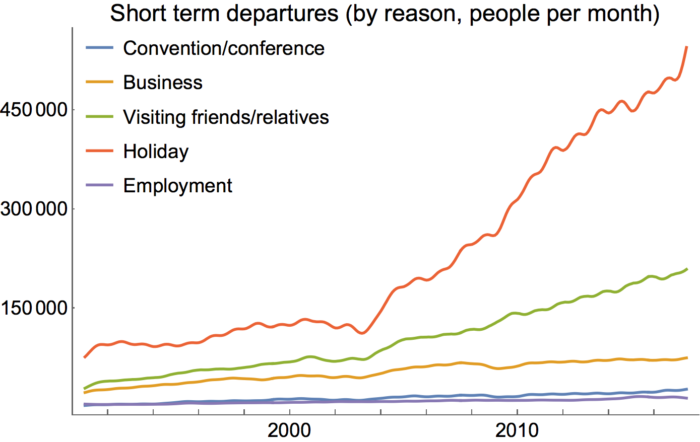
Figure 4: Holiday travel seems to have risen the fastest
And of course, there’s a graph which says that the fastest growth is in short-term trips as well.
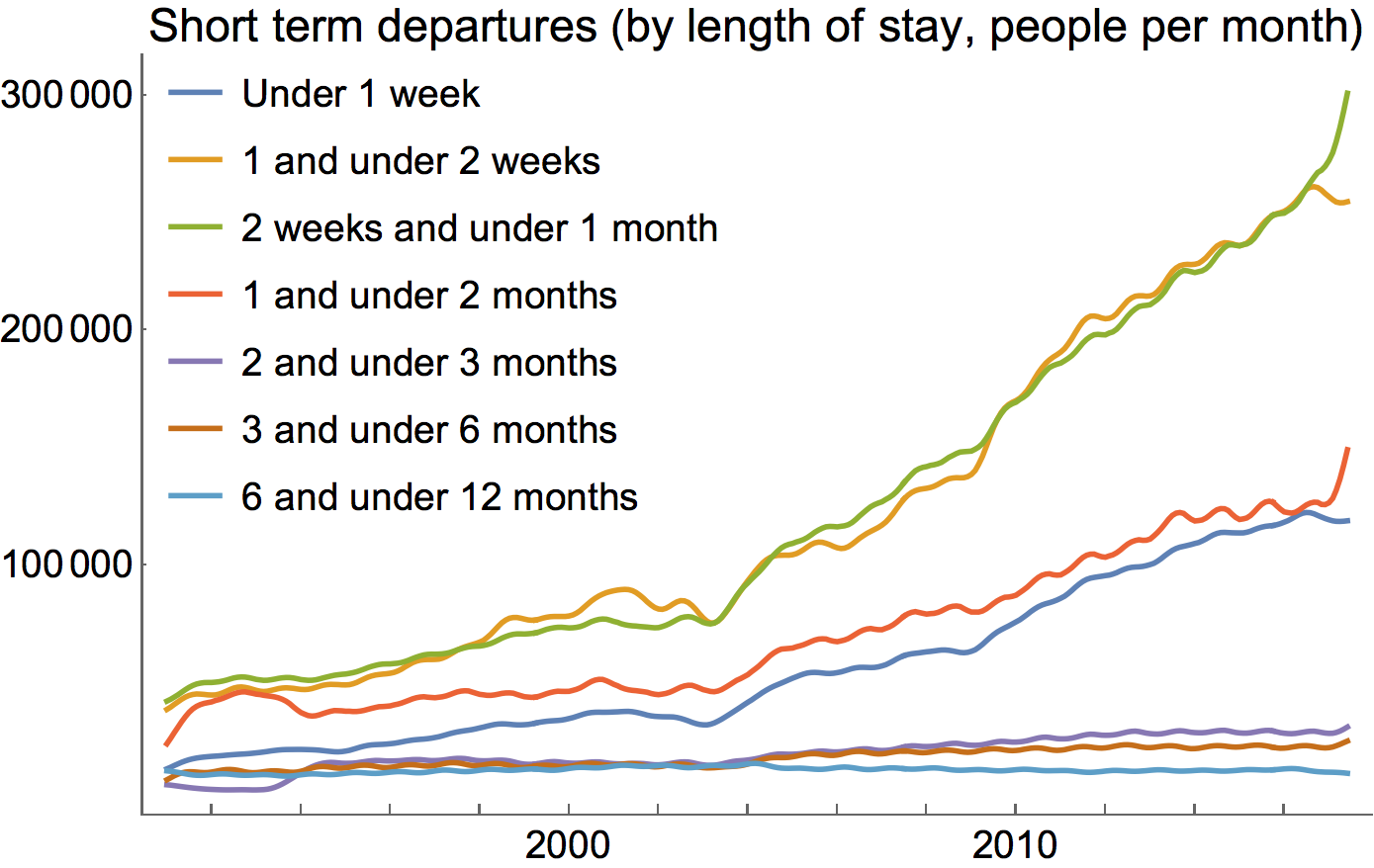
Figure 5: Very short travel seems to have risen the fastest
And departures to Indonesia also seem to have risen the most sharply from the mid 2000s as well:
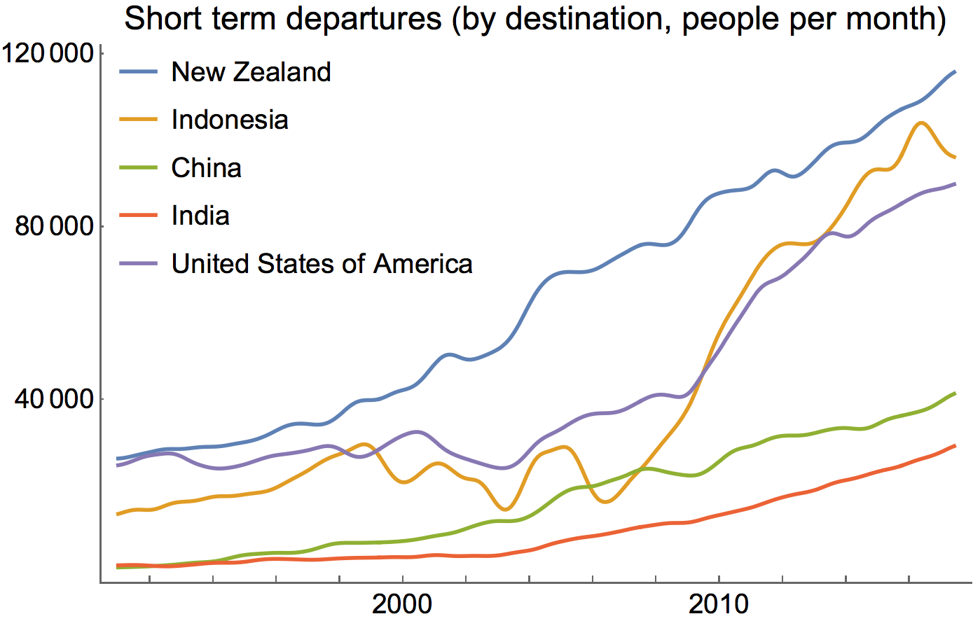
Figure 6: Indonesia rose very quickly as a destination
And there’s a hint as well that somewhat older people might make up a higher fraction of travellers of lately too.
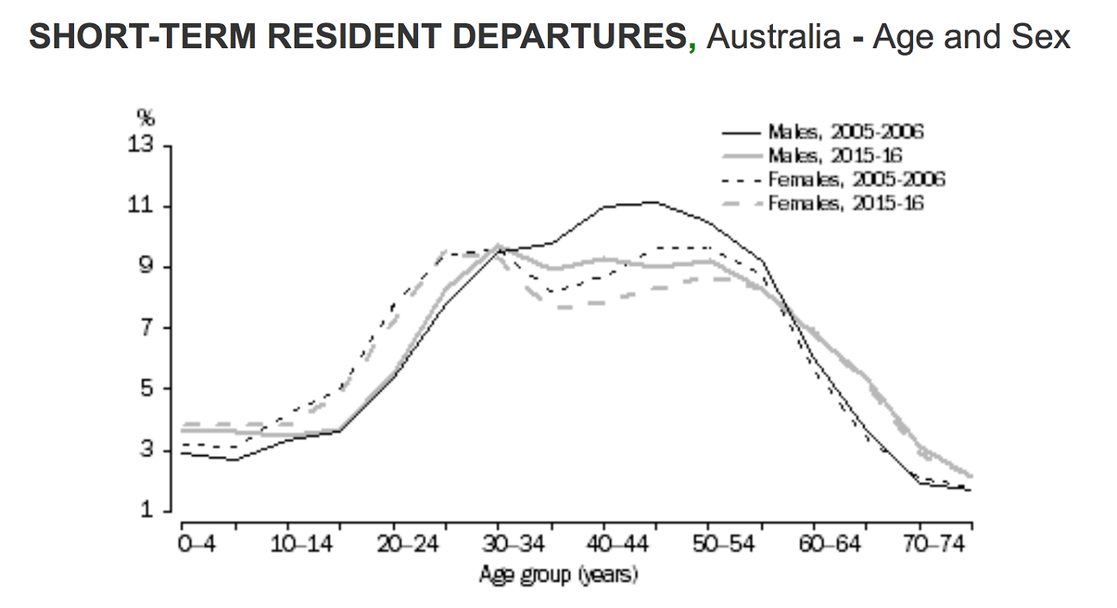
Figure 7: Older people are travelling more in relative terms
So it would be very tempting to conclude that the same set of travellers are driving the relevant trends in all of those cases, and that those travellers also constitute a significant share of the “Missing Million”. To do so would be to essentially make a whole sweeping set of assumptions which haven’t even been discussed, let alone tested, and some can be demonstrated to be substantially untrue.
Perhaps the easiest to tackle is the last graph, whch was used to suggest that a significant number of travelers might be the old boomers. The problem with this graph is that it’s expressed as a percentage. As I’ve previously outlined, the most striking trend in overseas travel is that it’s increased, quickly and relentlessly. If the two curves shown in Figure 7 referred to numbers of movements, the 2015-16 lines would be consistently far higher (about one and a half times) as the 2005-2006 lines. Whilst a somewhat higher share recently are 60-something than previously, movements are now so high in all other categories that change that caused the discrepancy could be in any other age-group just as easily.
With regards to the other data, first and favourite technique to test a hypothesis is to just have a look at relevant data with the Mk 1 eyeball. Adding in the cumulative discrepancy between NOM and Net Movements, we can see how and when the Missing Million actually grows:
Figure 8: The cumulative missing million doesn’t match
As we can clearly see there, the discrepancy between NOM and Net Movements seemed to have really become serious in the very early 2000s, quite possibly before the marked acceleration in Short-Term Departures. It does however appear that Short-Term Departures do seem to track somewhat with the cumulative discrepancy thereafter. However, the same isn’t the case with Departures by destination:
Figure 9: Travel to Indonesia was low while most of the Missing Million left.
Here it can be see that the accumulation of the first half of the Missing Million occurred while travel to Indonesia was actually low, and not growing. Furthermore, at precisely the time of the fastest acceleration in travel to Indonesia, NOM and Net Movements came closest to aligning. In contrast, travel to New Zealand grew consistently throughout this period, not to mention being higher throughout. I’d argue that NZ looks more likely by far at this stage.
My second favourite technique is to do just to a quick of some numbers, to see whether things add-up even roughly, at least to within an order-of-magnitude. Looking at the Short-Term-Departures by duration, we can multiply each series by an appropriate number to see what sort of impact each component might actually have on people actually absent from Australia. Not having any better information, I assumed that the distribution of movement lengths in each category was reasonably flat, and chose 4, 11, 22, 46, 77, 165, and 273 as the probable average number of person-days that each departure would reduce from Australia’s Physically Present Population. I then took the previous 12 month calculation and divided by 365 to find the total number of ‘person-years’ that each set of departures could contribute at any given point, to see which contributed the most.
Figure 10: Departures of longer than one month have the largest contribution to persons absent
We can see here that the impact of trips less than two weeks is very greatly diminished. The largest contributor to the Missing Million is likely to be trips of over a month, hardly a fleeting holiday.
But more interestingly, we can see that the short-term departures of all the trips under two months clearly can’t add up to anything like a million people. I did some calculations and found that in fact at the end of the data all the short-term departures probably only cumulatively add up to under 800,000. I suspect the assumption of a flat distribution across all the categories is likely to overstate absence if anything. Furthermore, at the end of 2001, before the Missing Million had left, those departures accounted for about 400,000 people absent. So it really isn’t plausible that all these departures listed actually account for anything like the full Missing Million, or probably even half of that. The sub-set of Boomers that Cameron Murray describes is doomed to be a trivial minority in any case.
There’s also the possibility of significant a shift internally within categories. It could be the case that my estimation of a flat distribution across each time interval is false, and some change has led quite systematically to some of the categories to become increasingly skewed, probably to the left (shorter trips) since the frequency of travel has risen so much. The switching over of the 6-12 month and 3-6 month lines seems to show some evidence of that occurring, however if a shift in that direction also occurs internally within the categories, we would likely have even less of the Missing Million accounted for.
A reality-check on Data Quality
There are a few things that could explain such a result, and as always it’s probably best to go back to the source of the data to try to understand why it is possible. A significant factor is that the data presented here is based on peoples indicated intent, as per their passenger departure cards, like this one:

Figure 11: The departure card assumed that people know whether they are ‘resident’ or ‘termporary entrant’.
The largest failure in these cards is asking people to self-select what type of traveller they are, most confusingly whether they are a ‘visitor or temporary entrant’ or ‘Australian resident’. Since these cards don’t come with any explanation of the 12/16 rule of ‘residence’ for migration purposes, these cards would make no sense for our increasingly part-time population, many of whom are foreign citizens, here on a temporary visa, but staying (as a Student, worker, or backpacker) for long enough to officially qualify to be ‘resident’ for migration purposes. So the entire data-series we’re working with here really is likely to be fraught with uncertainty, and doesn’t promise to consistently include those who should be counted, or exclude those who should not be.
Furthermore, there’s absolutely no obligation on the traveller to honour their ‘intent’ regarding travel. Often they may not have actually booked their onward or return flight. If I had to speculate a little as to the micro-economic dynamics that might be at work, I would think that plenty of travellers (particularly those on temporary visas in Australia) would wind up indicating something that was a poor reflection of what actually happens. With more and more people making multiple stops on their travels, with fewer of them planned in advance, they’re likely to make some educated guess about what the scary people at the customs gate are going to be most happy to hear, (including about their residency status) and just report that.
To add to this, not all the data captured in departure cards is comprehensively enumerated. According to the ABS, on average, only about 5% of the cards are selected for a sample, and most of the rest carefully imputed. Many of the methods I’m using below could well struggle if there’s even moderate errors or poor assumptions made in this sampling or imputation process. The strange results produced by our New Zealand regression below could be an indication of uncertainty or inconsistency in this process as much as anything else.
But perhaps more importantly, given the way that migration is defined under the 12/16 rule, there’s absolutely nothing preventing these ‘short term’ travels actually contributing to Net Overseas Migration, and hence not explaining a discrepancy between that number and Net Movements. Two six-month trips a couple of months apart will constitute migration. As will a two-week trip, if some was travelling a lot in the previous year.
Missing arrivals instead?
Trying not to be disheartened, we could look to see whether what data we do have could still clarify things further. So far we’ve only looked at half (or less) of the story. We have short-term arrivals as well:
Here a couple of things are striking. In particular, the under-1-week movement trend is ususally the highest, followed by 1-2 weeks. People arriving in Australia seem to report a far shorter intended stay than those leaving. And, the total number of arrivals is far far lower than the departures. This is also consistent with the hypothesis I’ve outlined earlier, that we’re a hard pace to get to for a short trip, but a good place to leave from for one.
Figure 12: Relatively long ‘Short-Term’ Arrivals have the largest contribution to persons absent
Here the plausible ‘second-half’ of the story emerges. By far the largest contributor to ‘person-years’ present in Australia from short-term arrivals is actually from the longest intended trips, of over six months, and the second-longest from 3-6 month visits. Importantly, there’s a far larger possibility that these ‘short-term’ visits will wind up being counted in Net Overseas Migration. Students or backpackers who stack up a couple of 6+ month visits inside a couple of years (probably even more likely than staying continuously) will almost certainly officially ‘migrate’. In stark contrast to the case for departures, the shorter categories are relatively tiny, and didn’t grow at all during the period when the missing million emerged. This goes a lot further towards explaining the true origins of the Missing-Million, and is further supports the hypothesis outline in my earlier post. The sorts of ‘visitors’ we get tend to be longer-term visitors, but still visitors, where as our travel outwards tends to be for faster visits.
Again, summing the total ‘person-years’ accounted for by this trend, we find there are just under 800,000 people in 2017, and just over 400,000 in 2001. Three quarters of this increase can be accounted for by movements where the stated intent longer than six months. If a large fraction of these are counted within migration, and I think it’s almost certain that they are, then the person-years present due to short term visitors would barely have moved. If a significant share of the 3-6 month intentions were also counted as ‘migration’, then the person-years present would have moved backwards due to short-term arrivals. This could explain a further part of the discrepancy between Net Overseas Migration. However, it also seems likely to not add up to be enough to reach the million.
To confirm the failing significance of passengers’ stated intentions, it looks like the ABS is also going to abandon these particular series.
An interim summary
So far, having just eyeballed some data and done a couple of quick calculations to see how the numbers stack up, it appears:
- The Missing Million grew to half its height while travel to Indonesia was low and flat, and travel to New Zealand was increasing.
- Person-year absent due to ‘short-term’ departures is driven by travel between two-weeks and two months. Very short holidays don’t contribute much. But all this data on stated intent can’t account for the Missing Million.
- Person-years present due to arrivals is driven by long stays of 3+ months, and overwhelmingly by 6+ months. If a large slice of these are counted in ‘Net Overseas Migration’ movements, the loss of arrivals could account for another part of the Missing Million.
- The data is fraught with uncertainty in any case, and all our work here should be taken with a grain of salt.
Unpacking correlation
What we haven’t yet tackled seriously is the assumption of a high-overlap between the four different trends, or at least the three which we have data on. To establish or refute this, it’s better that we look at the information available to us, in its raw (monthly) format. As we can see, the intense seasonality present in some of these time-series can provide us with a key to possible analytic mechanism that could investigate the plausible degree of overlap.
Figure 13: Monthly departures by duration show clear seasonality
Figure 14: Different Countries also exhibit different seasonal patterns.
(Note, one can click the countries in the legend to turn off a series, or double-click a country to show a single series. This helps to isolate or inspect individual trends.)
Figure 15: New Graph of Movements
From the above two charts it can be quite easily seen that the slump in departures growth that occurred in the mid-2000s and the dramatic elevation in it after about 2008, is concentrated in South East Asia and to some extent the USA. This is again consistent with Australia now competing with other attractive pacific destinations as holiday spots, but probably acting as something of a home-base for people wanting to explore South East Asia. Arrive long-term to Australia, but leave short-term, frequently, to explore Asia.
Figure 16: Monthly Departures by Purpose also show contrasting seasonal structure
It should be noted here that while holidays have been the largest growing single component, there’s clear evidence here that visiting friends is a significant driver of the December annual peak in departures. This seems also to align with a strong December Peak in departures that occurs in departures to New Zealand (which is less present in departures to Indonesia), and also in slightly longer travel times, including 1-2 month visits.
All this strongly points towards some significant overlap between the largest contributors to ‘persons absent’ due to departures being New Zealanders visiting friends or family back home, rather than boomers in Bali, though the degree of the overlap is still hard to prove.
Dive with me baby!!
We could go further to try to substantiate that claim using some more advanced statistical techniques, for those who want to dive even deeper into the data. For example, we could use a decomposing function to isolate the seasonal and trend components in a given time series, such as this call of stl() does this using the loess smoother:
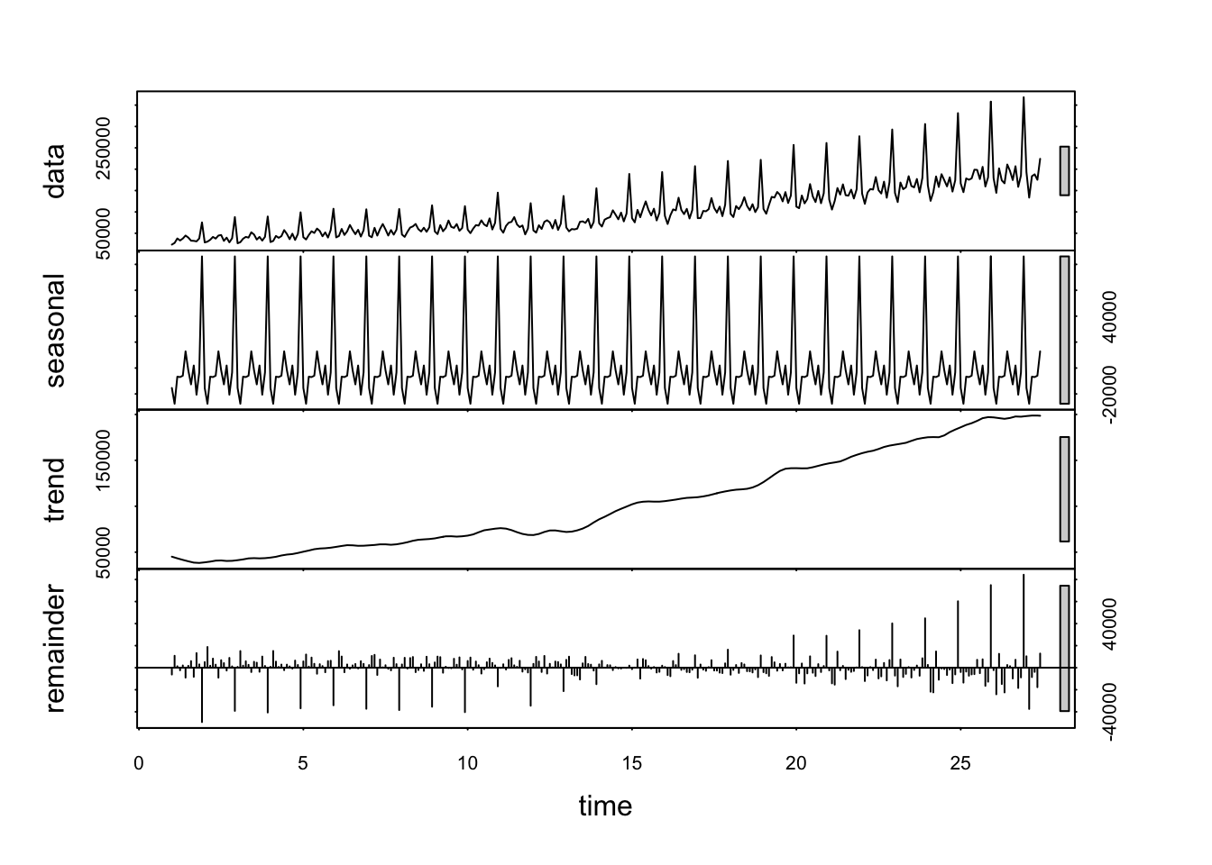
Figure 17: A decomposition of departures for the purpose of Visiting Friends or Family
We could then compare the seasonal component (in the second pane) with other seasonal structures in different category types. However, as can be seen from the asymmetric errors in the bottom pain, the growth in the seasonality of the series isn’t perfectly accounted for. This highlights that the structure of the seasonality is subject to change as well within the time-series. Again, my preferred method to get a sense of how this might be the case is to use the Mk 1 eyeball again for a quick check. Another visual representation of the raw data is to overlay the different years on top of one another.
Figure 18: A clear december spike exists for departures to visit Friends
And one can see intuitively how there could be a significant overlap with this sort of series:
Figure 19: A clear december spike exists for departures for 1-2 months
And also might have quite a strong overlap with this sort of series:
Figure 20: Seasonality of movements to New Zealand also exhibits a December Spike
Or at least, one could say it probably has a stronger overlap than with this sort of series:
Figure 21: Seasonality of movements to Indonesia exhibits no December Spike
Which might have more of an overlap with this sort of series:
Figure 22: Seasonality of Holiday Movements
All in all, this really just serves to pose more properly the question: What is the actual composition of these time series, in terms of the other ones? Are departures to Indonesia predominantly short, and departures to New Zealand substantially longer?
Dive Deeper
It might be possible to attain to substantiate this sort of eye-balling activity statistically using a multivariate regression. Essentially all this is doing is seeing which combinations of one division of departures corresponds best to a particular series in another characterisation. This is easily done, though care should be taken when interpreting the results, a summary of which might look like this:
##
## Call:
## lm(formula = Numb.of.move.New.Zeal ~ . - Date, data = kiwi_length_regressor)
##
## Residuals:
##    Min     1Q Median     3Q    Max
## -41967  -6259   -269   6877  30353
##
## Coefficients:
##                                  Estimate Std. Error t value Pr(>|t|)
## (Intercept)                     1.381e+04  3.119e+03   4.427 1.33e-05 ***
## Num.of.mov.Und.1.wee            4.748e-01  6.952e-02   6.830 4.49e-11 ***
## Num.of.mov.1.and.und.2.wee     -1.661e-01  5.369e-02  -3.094  0.00216 **
## Num.of.mov.2.wee.and.und.1.mon  3.578e-01  5.254e-02   6.810 5.09e-11 ***
## Num.of.mov.1.and.und.2.mon     -6.041e-02  5.835e-02  -1.035  0.30132
## Num.of.mov.2.and.und.3.mon      1.046e+00  1.269e-01   8.248 4.65e-15 ***
## Num.of.mov.3.and.und.6.mon     -2.139e+00  1.677e-01 -12.752  < 2e-16 ***
## Num.of.mov.6.and.und.12.mon     1.648e+00  2.061e-01   7.995 2.58e-14 ***
## ---
## Signif. codes:  0 '***' 0.001 '**' 0.01 '*' 0.05 '.' 0.1 ' ' 1
##
## Residual standard error: 10920 on 310 degrees of freedom
## Multiple R-squared:  0.8832, Adjusted R-squared:  0.8806
## F-statistic: 334.9 on 7 and 310 DF,  p-value: < 2.2e-16
Probably an easier way to understand the output is to say that a model was constructed attempting to reproduce the data of Departures to New Zealand, by adding different amounts of all the series for different durations of departure. The model that was fitted to the data ended up looking like this:
Figure 23: Multivariat Regression of Kiwis Unconstrained
And was composed of the following weightings of the length of departure series:
Uncon Kiwi Coefs
Figure 24: NZ Departures Unconstrained Coefficients
This is shows something odd, it appears that there’s a negative weighting of several of a couple of the components. This doesn’t make any sense, as you can’t have a negative number of departures. In addition I’ve shaded the colours here with the log of a variable of the output of the model called Pr(>|t|), which gives an indication of the likelihood that of this original data occurring if that co-efficient wasn’t present at all. In other words, darker colours give a higher degree of confidence that that particular coefficient weighting is likely to be good.
Seeing relatively light colours for slightly negative coefficient values is probably ok, (as it’s quite probable that having none of this component, or a very small positive value wouldn’t throw out the fit too much) but finding an extremely dark one for a large negative value means that the results are overall likely to be somewhat unrealistic. It appears that the negative value is likely compensating for over-weighting of the other two components to the left and right. To understand why, let’s look again at what the spectrums suggest:
Figure 25: A clear May spike exists for departures for 3-6 months
Figure 26: A clear december spike exists for departures for 6-12 months
Here we can see why the regression came up with this result. Departures to New Zealand slump in May each year (see Figure 19), and 3-6 month departures have a peak in May. Subtracting that component consequently improves the fit substantially, though it’s not a physically possible result. Overall, it appears that my attempt to get these statistical methods to substantiate a proposed split between the different visit duration seems to have failed. It’s probable that in New Zealand’s case the implicit assumption (that the distribution of trip-lengths to New Zealand is relatively stable over time) doesn’t hold well. We’ll relax this assumption a little later to see if it improves things, but first let’s just check to see how close a more-realistic model can come.
To get a more realistic model, we can re-run the regression with a constraint that requires all the co-efficients to be non-negative. Happily there’s an R package called nnls by Katharine Mullen which can quickly create such a model. The result is this:
Kiwi Constrained
Figure 27: Multivariat Regression of Kiwis Constrained
This produces two curious results. It shows that with a constrained model not nearly as much of the seasonal fluctuation can be incorporated, and the December spikes in particular don’t match up as well. However, in an odd twist of fate, the fit of the 12-month running average is actually better, with a slightly higher R-squared match. This suggests that the adjustment made to the coefficients between the unconstrained model and this one are almost certainly more in line with long-term, as opposed to intra-year trends. By plotting the co-efficients, we can see what that is:
Con Kiwi Coefs
Figure 28: NZ Departures Positive Coefficients
Not being able to include a large negative weighting means that the magnitude of the other positive weightings also decreases. In this case, I strongly suspect that the lower weighting of 6-12 month departures (which were completely flat in overall trend) actually assisted in better matching the trend. Sadly nnls() doesn’t yet have as easy a way of pulling out Pr(>|t|) so I wasn’t able to give that indication of confidence with a colour scaling.
The graph also shows that we have a weighting of 6-12 months that is over one, which is also unrealistic, since we can’t have 120% of 6-12 month departures all going to New Zealand. With more time and resources there would certainly be means of further constraining the models, including with the outputs of other regressions on other variables, to make a fuller and more consistent model. But first let’s just multiply these ‘weightings’ by the mean actual number of travel undertaken under each departure length, and then by the average length of stay, to convert the coefficients back into numbers which are easier to make some sense of: numbers of departures monthly, and number of ‘person-years’ absent that could be attributable to that flow.
Figure 29: NZ Departures Positive Coefficients Weighted
This leaves us in a somewhat unsatisfying place. It indicates that there might be a significant number of people ‘absent’ in New Zealand due to longer trips, but we also know that it’s impossible that more than 100% of the trips over 6 months went to New Zealand. The model isn’t producing realistic values yet, so we can’t have any real confidence in the levels indicated there. In addition, these values are taken for a mean for the entire period, which isn’t actually that helpful since we’re actually most interested in how the trends look over time.
Differentiating with respect to time
This means that it’s time to break the data up into different time increments and see if we get more realistic data, or clearer trends, by stepping through time. Incidentally taking a derivative with respect to some sensible dimension (in this case time) is also my favourite technique for rescuing some sensible, more confident conclusions when there’s extremely high uncertainty in a particular level that’s been measured. Since derivatives aren’t dependent on a particular level, only a trend, we could still get a sense of whether the significance of these components is increasing or decreasing over time with greater confidence.
Figure 30: Multivariat Regression of Kiwis Unconstrained
This graph shows the results of running three different multi-variate regressions on the three time-intervals indicated. As you can see, the fits now look quite impressive. However, the unconstrained model still relied upon some unrealistic methods to get such good results:
Figure 31: NZ Departures Unconstrained Coefficients
Again, in all three of these fits, the most important elements (dark colours) tended to be unrealistic, both extremely large (greater than 1), and negative. The note-worthy exception, if anything, could be the improved significance and scale of very short-term trips in the middle period. But overall this result confirms little. Let’s see how constraining the coefficients works.
Figure 32: Multivariat Regression of Kiwis Constrained
Here we can see that the model was still able to reflect the overall trend quite well, however seasonal fluctuations were poorly accounted for, especially in the later period. This strongly suggests that within each year there could be substantial shifts in the average trip-length of a visit to New Zealand. This sounds quite plausible, as shorter holiday visits might be made to New Zealand in the winter for skiing, while longer visits to spend time with family back home might be more common in the larger summer holidays, in particular for the substantial NZ expat community that lives (substantially) in Australia. I won’t dive down that rabbit hole just now, instead let’s check out how the coefficients for this constrained model looks, just to see how close to the realm of plausibility they lie.
Figure 33: NZ Departures Positive Coefficients
If anything one could say that there’s a lack of evidence that visits to New Zealand are short term, and weak evidence to suggest that an increasing share might be slightly longer, but the unrealistically large coefficients confirm most strongly that the model doesn’t hold well. Our time-invariance assumption on the intra-year level is failing. But just to put an order-of-magnitude on the corresponding implied departures, and people absent, we should multiply by the relevant weights for each series, and estimated duration of absence:
Figure 34: NZ Departures Positive Coefficients Weighted
This suggests that if there is a significant share of longer trips, it’s these that are far more likely to constitute a larger share of the missing million. However, even the shorter trips of a few weeks could plausibly contribute around 50,000 people of the Missing Million.
To make the most of an uncertain insight, I’ll again revert to my favourite technique, compare it to something else, or take a derivative so to speak, so we can at least see how different it is to something else. Let’s have a look at a similar regression model for departures to Indonesia.
Figure 35: Multivariat Regression of balis Unconstrained
This is an interesting contrast, since in this case the trend line (sum of previous 12 months divided by 12) doesn’t actually fit much better than the monthly exact figures. In fact, there are periods where the fitted line seems to do quite a good job at capturing the seasonal fluctuation, whilst the overall level is a bit off. Unlike New Zealand, it looks a bit like the time-invariance assumption regarding the distribution of departures amongst the different intended lengths of travel holds quite well within a given year, but perhaps not so well in the larger drift of time.
Let’s inspect the model to see what sort of results we’re getting:
Figure 36: Indonesia Departures Unconstrained Coefficients
This looks like a far better result. We can see here that the component with the greatest statistical confidence (dark colour) is a positive component, and less than 1, which means that it’s a realistic number. The largest negatives also have the least significance statistically (lighter colour). Overall this looks far better. Let’s see how whether it translates to a decent model with only-positive coefficients.
Figure 37: Multivariat Regression of balis Constrained
It certainly does. This model looks almost as good as the un-constrained one, with the exact fit almost as good, though the trend line in the middle period does slightly worse at keeping with the original data. Examining the components of this model, we find a clear story emerging about short-term travel.
Figure 38: Indonesia Departures Positive Coefficients
In this respect, Cameron Murray looks like he was right, indeed travel to Indonesia does tend to be short term, or so it seems here. What he was wrong about though was that this comprises a significant component of the Missing Million:
Figure 39: Indonesia Departures Positive Coefficients Weighted
As we can see here, even a solid 35,000 departures per month only adds up to about 12,000 people continually absent over such a short trip. However, this is only taking an average over the whole period, and we’d be negligent not to investigate how that might have changed over time. Whilst it would be tempting to test a variety of change-point detection algorithms to optimise the selection of different breaks in the series, for consistency and expediency I’ve broken the series into the same intervals as I did for New Zealand, at the turn of the decade.
Figure 40: Multivariat Regression of balis Unconstrained
We can see now that the middle-section does far better at capturing the trend, and overall the fit looks quite good. Let’s see how the coefficients change in the three periods.
Figure 41: Indonesia Departures Unconstrained Coefficients
Perhaps the most striking feature here is the prevalence of some larger negative co-efficients in the middle period. This is intriguing, and suggests overall that the model functions less well in this period, again most probably because the time-invariance assumption holds less well. The other significant trend is that in the late period there’s a substantial shift towards longer travel. Let’s see if those trends persist in a constrained model with positive coefficients.
Figure 42: Multivariat Regression of balis Constrained
Things look good. Those fits are barely any worse than the unconstrained version, except in the middle, where (as expected) the fit isn’t as good. Those coefficients are:
Figure 43: Indonesia Departures Positive Coefficients
This seems to still tell a sensible story. Travel to Indonesia mostly consists of short trips, but there’s been a noticeable increase in both very short, and quite long trips of late. Let’s multiply that by the right weights and durations to get the impact on travel in numbers we can understand.
Figure 44: Indonesia Departures Positive Coefficients Weighted
Finally we have a result which we can put some more faith in. Travel to Indonesia was dominated by quick trips when it was low in the 90s and 2000s. Since 2010 the largest increase has also been in short trips, probably of 1-2 weeks duration. However, it’s likely that there’s been a noticeable, and new component of longer trips. Whilst substantially smaller in number, it’s plausible that this shift towards longer-term visits accounts for even more absentees from Australia overall. However, even combined, the growth in short term departures between the decades of the Noughties and the Teens could only account for about 50,000 people, around 5% of the Missing Million, and a negligible portion of the significant share that had grown in the years prior to 2010.
Conclusions
Even if we neglect entirely the unrealistically large component of longer departures (6-12 months) to New Zealand, in the post 2010 period it’s plausible that New Zealand contributes nearly as many towards the Missing Million from journeys of just a few weeks duration. Adding in at least the hint that longer visits are a significant component of journeys to New Zealand, it’s almost certain that they comprise a larger share than visits to Bali.
However, perhaps the more important conclusion to draw is that only a trivial fraction of the Missing Million is accounted for by short-term visits to both Indonesia and New Zealand, and even all of the “Short Term” departures don’t come close. Other elements, including our long-term movements and short-term arrivals, are needed as well to understand what is going on. The extent to which these series overlap or exclude one another is completely unclear.
Realistically, far more work has to be done to really understand the complex dynamics of Australia’s population. The statistics need a lot of work to shed substantial light, and grasping at the easiest available story is likely not sufficient. ABS has recently decided to abandon the requirement for people to fill in departure cards, and doing so has actually caused another series break in 2007, which I’ve neglected to give any consideration to here. Apparently, the ABS is realising that the data collected on them wasn’t adding up and isn’t helping.
Overall I’m inclined to maintain what I’ve previously claimed, that immigration data is one of the most falsely-revered ‘clean’ statistics in existence. The hardest numbers we have still show evidence of substantial discrepancies, enough to radically alter the policy conclusions we typlically draw from them. The more detailed numbers we tend to reach to construct narratives to defend our use of them generally don’t add up, or aren’t consistently or comprehensively recorded enough to indicate anything at all with any confidence. The best narrative to explain the Missing Million is the enormous increase in international mobility. This, coupled with our peculiar economic, political, and overwhelmingly geographical circumstance has left us with a ‘part-time population’, and a frothy figure of ‘residents’ that is consistently and substantially higher than the number of people we physically have here at any given time. The nature of this dynamic could benefit from further work, and I welcome any further critiques or contributions.
Q.Q.
The .Rmd file for this post can be accessed which will require the installation of this package to run.